Coé Biquíni Bar
Branding
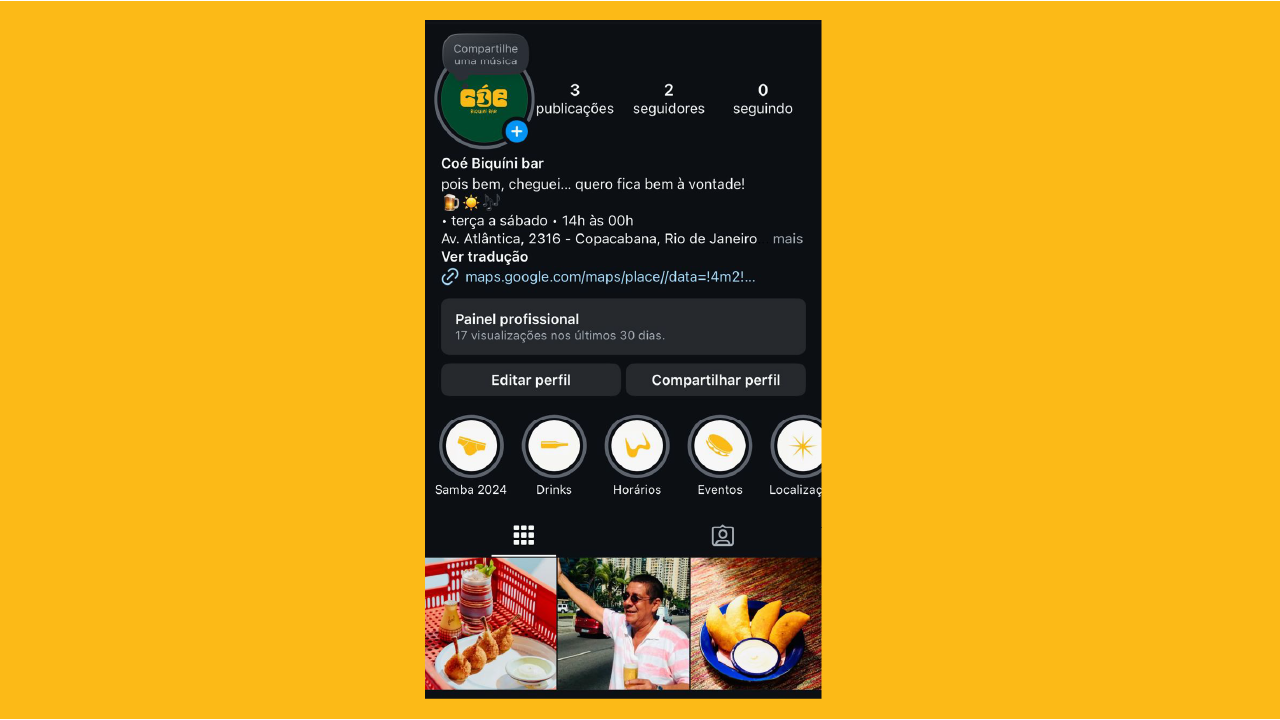
Coé Biquini Bar is a fictional branding project developed in an academic setting, with the goal of designing a vibrant, culturally-rooted visual identity for a fictional bar located in Copacabana, Rio de Janeiro. Inspired by the legacy of Tropicália, the project merges Brazil’s rich musical heritage with a fresh, contemporary aesthetic that celebrates diversity, community, and artistic expression.
More than just a bar, Coé is a space of cultural resistance and celebration. Its core values—support for cultural expression, comfort and belonging, and the joy of tropical sounds like samba and Bossa Nova—are deeply embedded in the design process. From concept to execution, this project aims to reinterpret Brazil from a local and affectionate perspective.
Understanding the Audience Through the Persona
To build an identity that felt real and grounded, the persona of Matheus Nkosi dos Santos was developed. Matheus is a 28-year-old Black architect living in Rio de Janeiro, specifically in Barra da Tijuca with his husband and their three cats. Spiritually connected to his roots, he is a practitioner of religions of African origin and regularly attends friday-night rituals. Deeply passionate about samba and pagode, Matheus plays the pandeiro and enjoys painting watercolors in his free time.
Matheus’s life is a blend of tradition and modern expression, art and community—exactly the kind of person who would feel at home at Cóe Biquini Bar.
Double Diamond Model
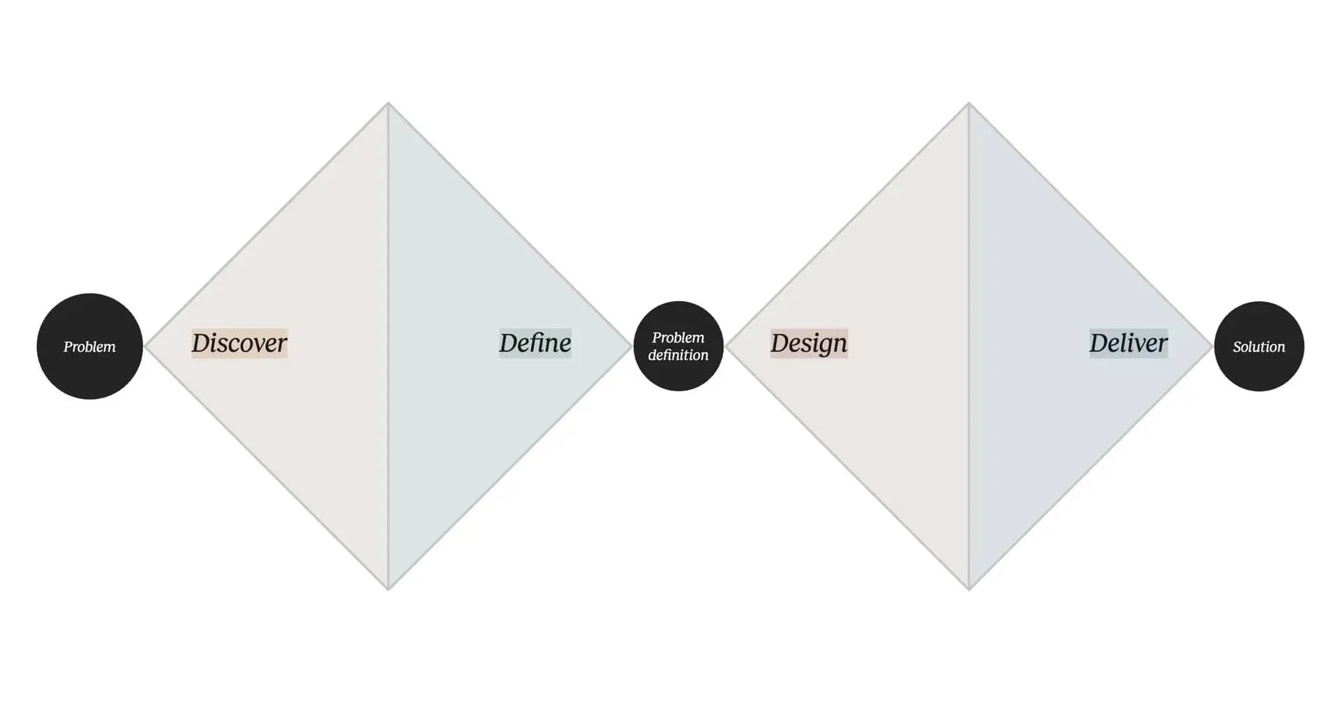
The development of Cóe Biquini Bar’s visual identity was guided by the Double Diamond framework, which allowed the project to unfold in an organized yet creative way. This methodology helped align research with intuition, ensuring the final design was not only beautiful, but also deeply rooted in meaning.
Discover: Research the Brazilian cultural landscape—specifically the Tropicália movement—exploring its aesthetic codes, musical influences, and resistance-driven spirit. Analyze how local bars embody cultural expression and gather insights from visual trends tied to samba, Bossa Nova, and the Carioca lifestyle.
Define: Narrow down the essence of the bar: a vibrant and inclusive space that expresses Brazil from an insider’s perspective. Define the brand values—cultural celebration, comfort, and freedom of expression—and build the persona that represents the emotional core of the audience.
Develop: Brainstorm and prototype logo concepts, color palettes, and typography that reflect the project's tropical and groovy aesthetic. Experiment with visual metaphors (such as transforming the “O” into a bikini) and design components that reinforce the bar’s atmosphere of joy and belonging.
Deliver: Finalize the full visual identity—including logo variations, color palette, typography, and branded mockups for digital and physical applications. Ensure the design communicates the bar’s spirit clearly, embracing cultural richness and a contemporary Brazilian voice.
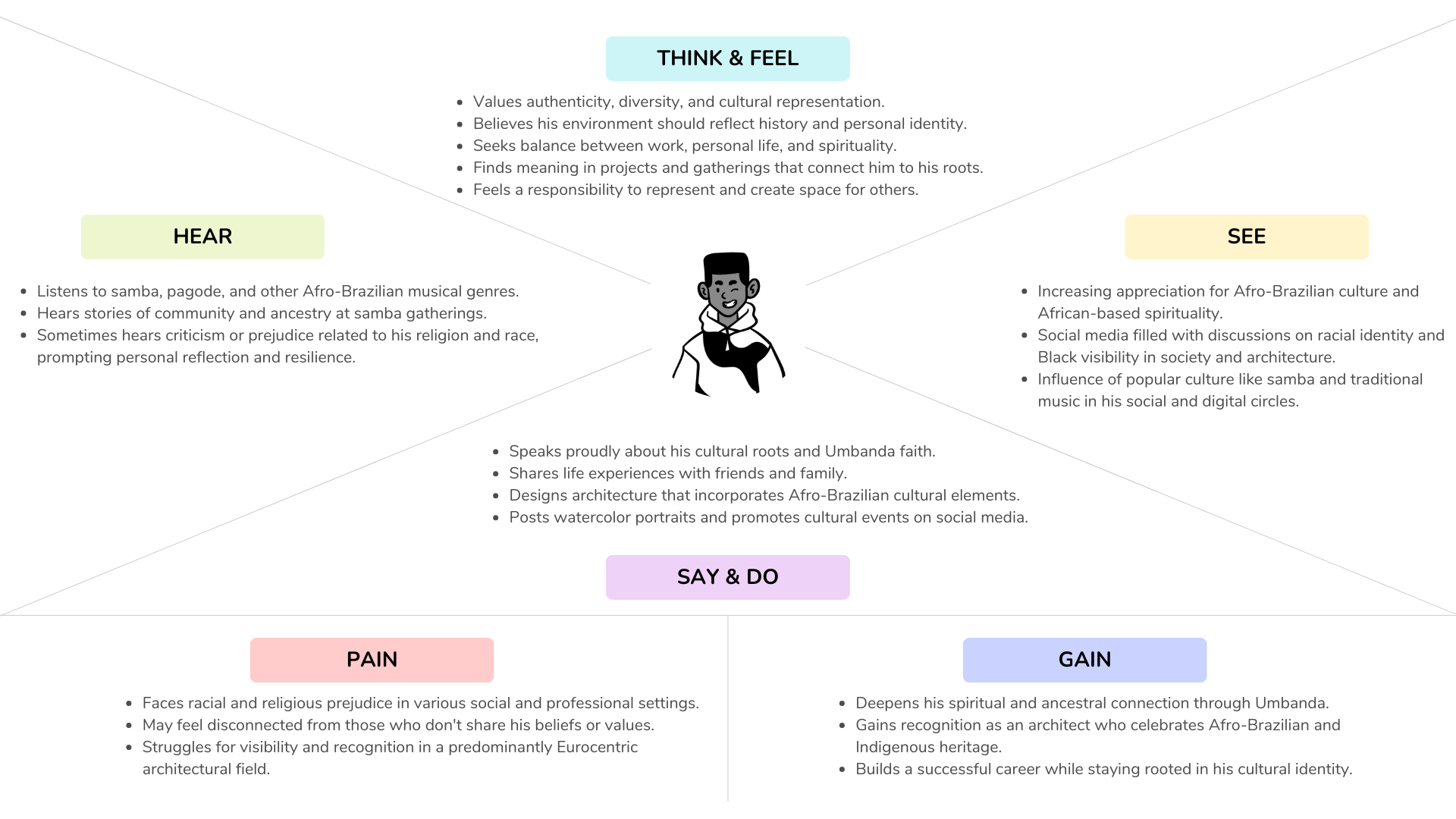
Empathy Map
To better understand the emotional landscape of the target audience, an Empathy Map was created for Matheus, helping define how he sees, feels, acts, and connects with his environment. This tool was essential in shaping a brand that not only looks Brazilian, but feels Brazilian.
CSD Matrix
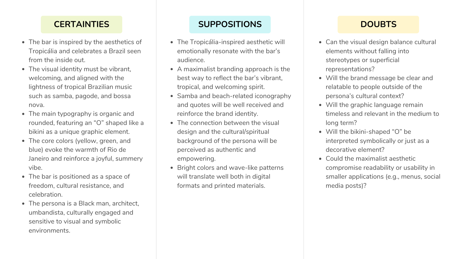
The CSD Matrix (Certainties, Suppositions, Doubts) helped structure the design priorities, keeping the focus on cultural authenticity. Certainties like "Brazilian design should not look imported" shaped the choice of visual elements, while doubts about the fine line between cliché and homage inspired a careful curation of symbols, colors, and language.
The logo
The visual identity was designed using a fun and groovy approach—joyful, and unapologetically Brazilian. The project began with conceptual and strategic research using the Double Diamond framework, followed by a human-centered design process with tools like persona development and empathy mapping.
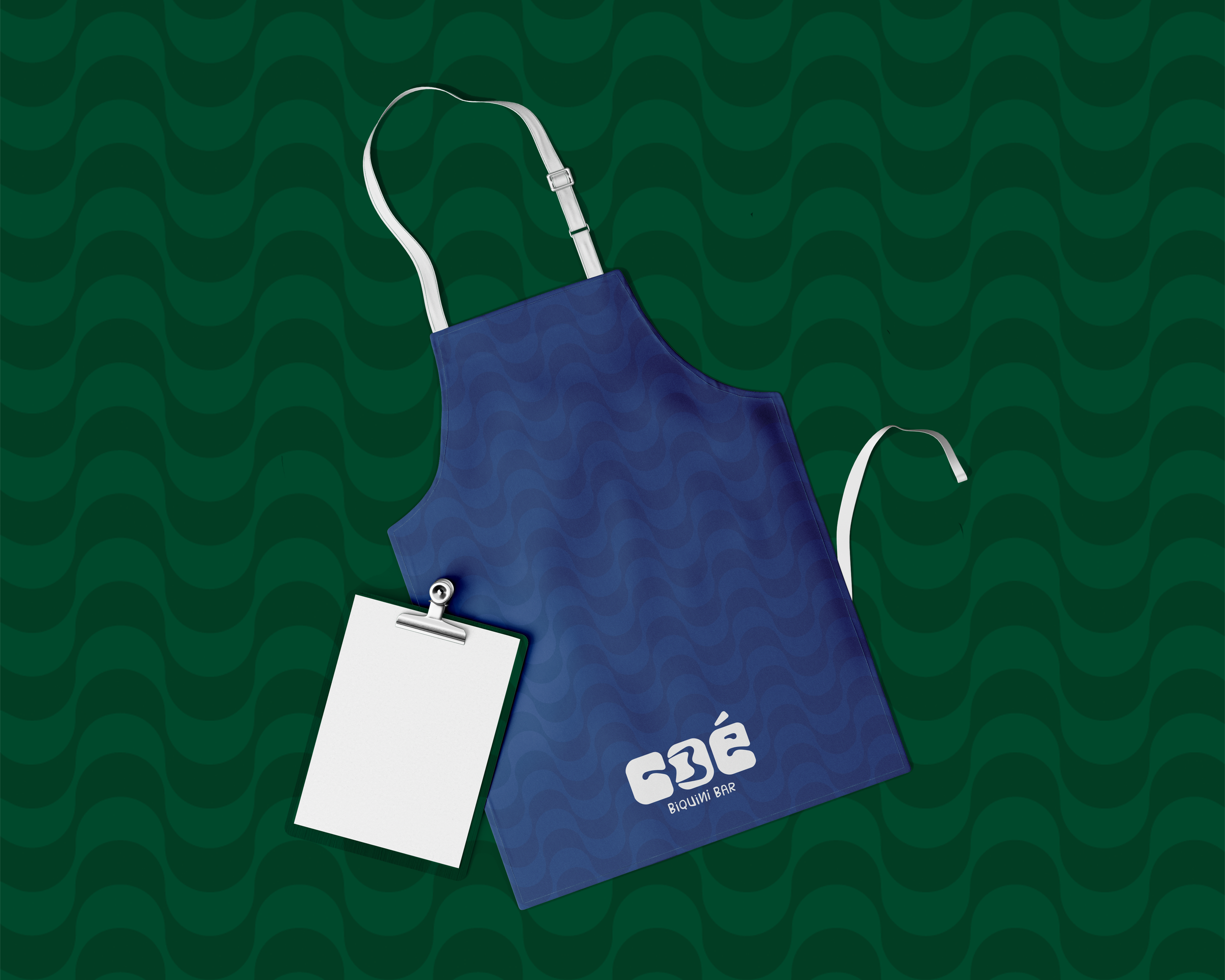
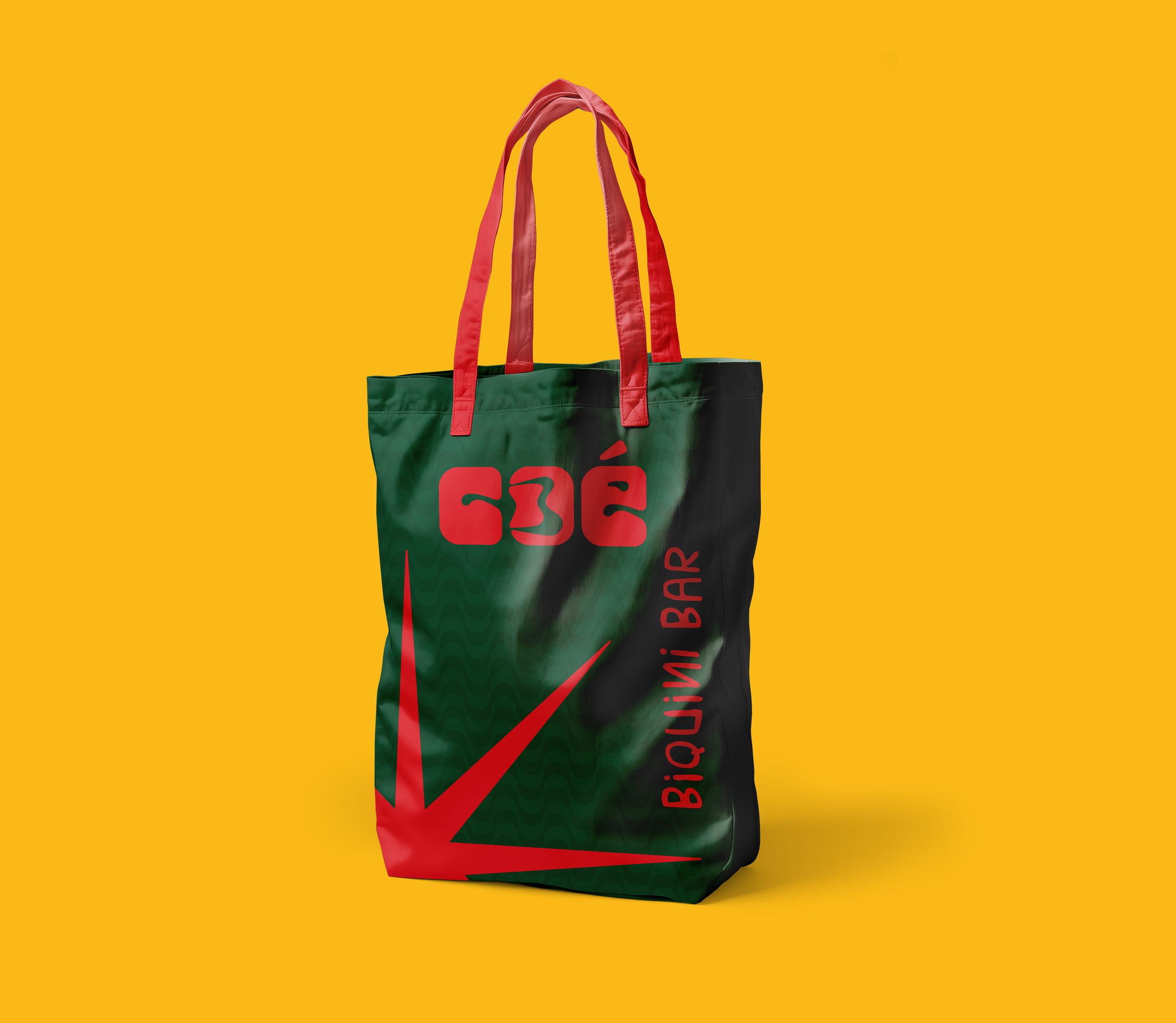
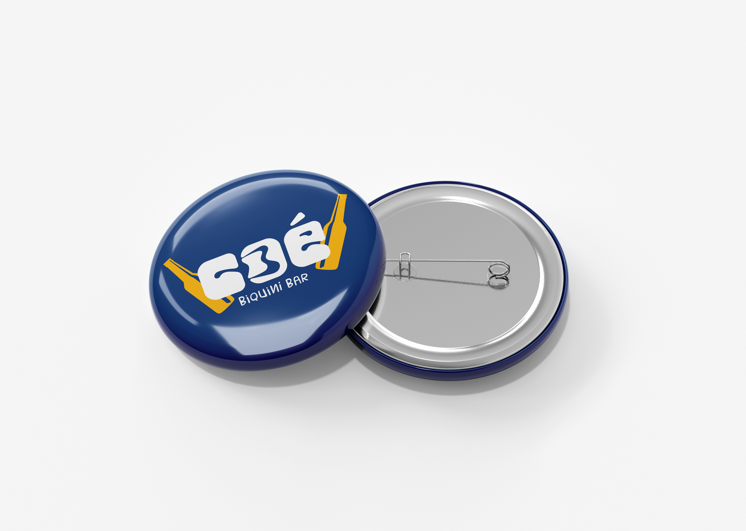
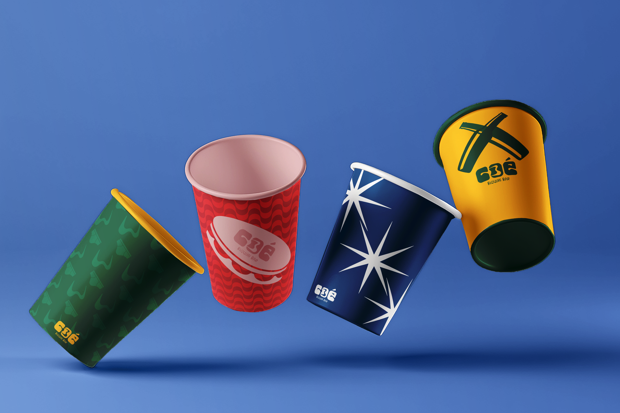
The visual direction embraces organic and rounded typography, where even the “O” in the logo morphs into a playful bikini icon. Wavy patterns, beach-inspired textures, and lyrical phrases drawn from samba songs all contribute to the rich sensory atmosphere of the brand.
Final product
Cóe Biquini Bar is more than a branding project—it’s a joyful declaration of Brazilian identity. Through every rounded curve, every sun-drenched color, and every rhythmic phrase, the design captures the heart of a Brazil that is alive, expressive, and resistant. It’s a place where the past and present meet through song, sea, and soul.
The identity doesn’t shy away from complexity. Instead, it embraces the contradictions and layers that define Brazilian culture: spiritual and festive, traditional and avant-garde, intimate and communal.
Though fictional, Cóe feels alive. It’s a project born from cultural memory and future aspirations—where everyone is welcome to sing, celebrate, and simply be.

Kernel Magazine
Editorial Design
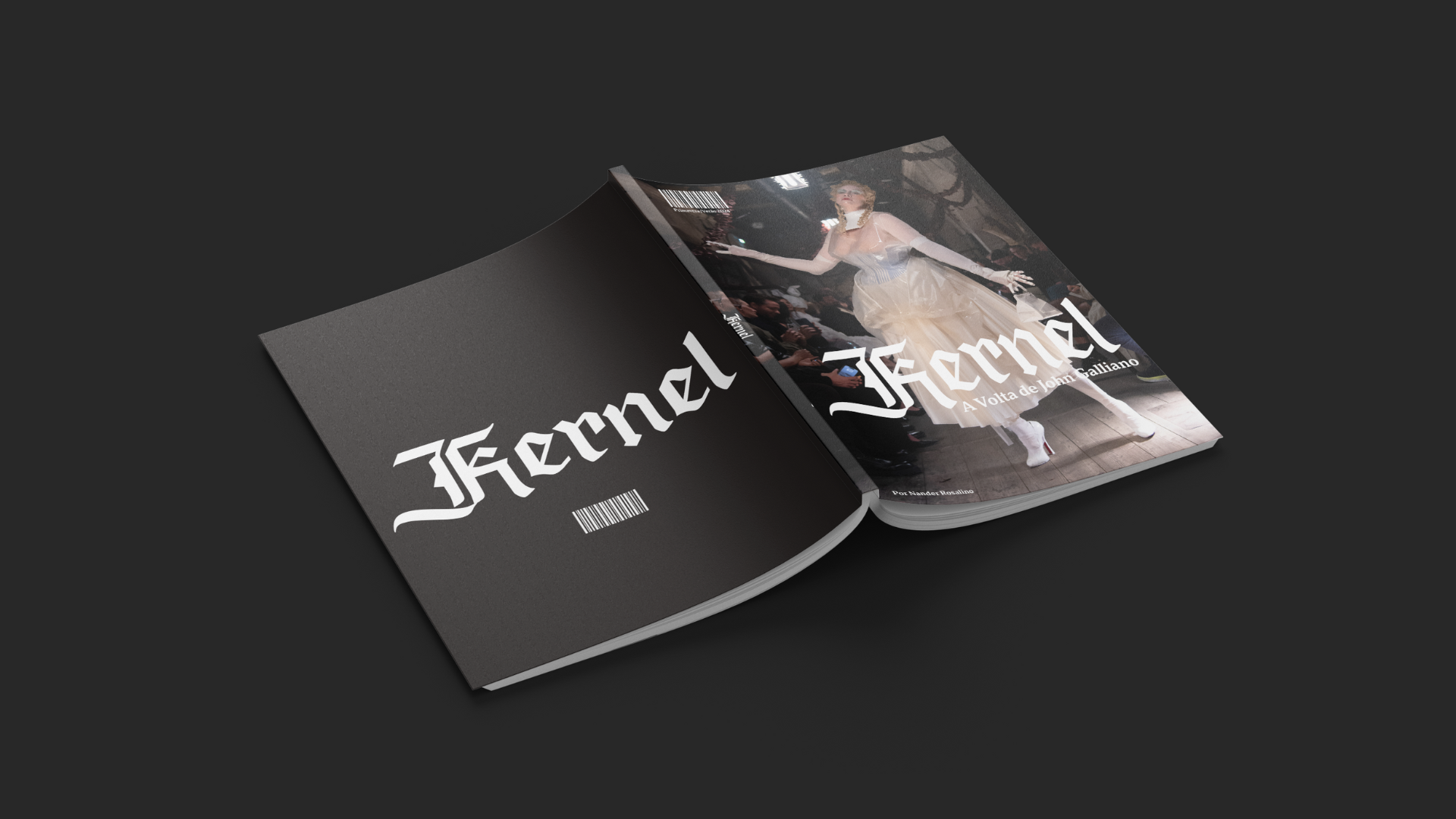
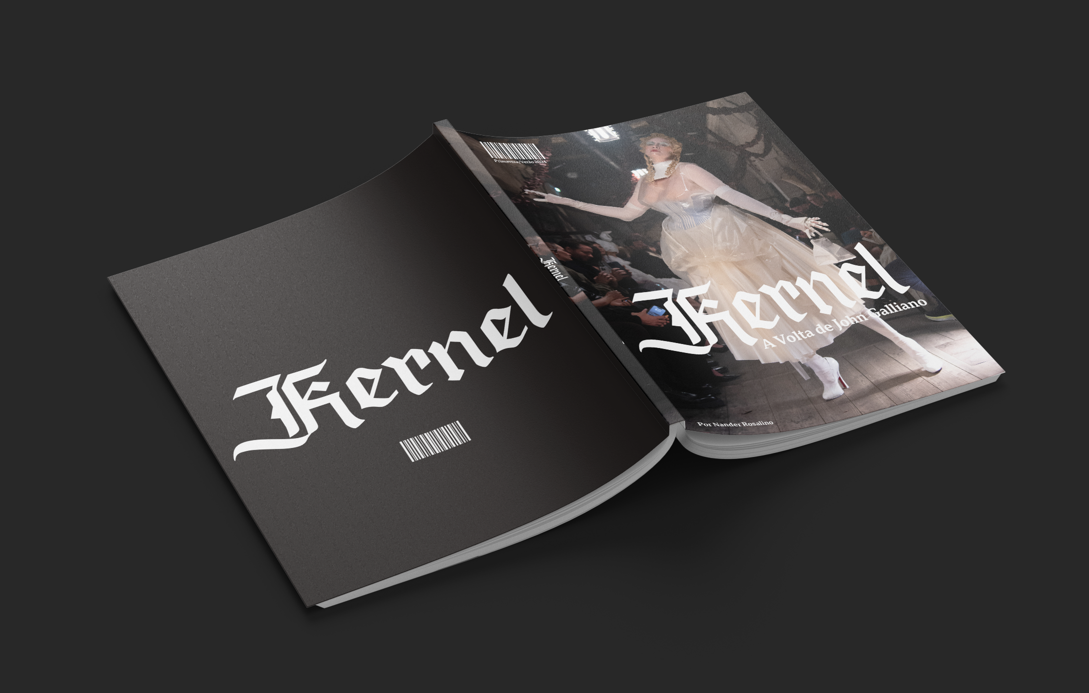
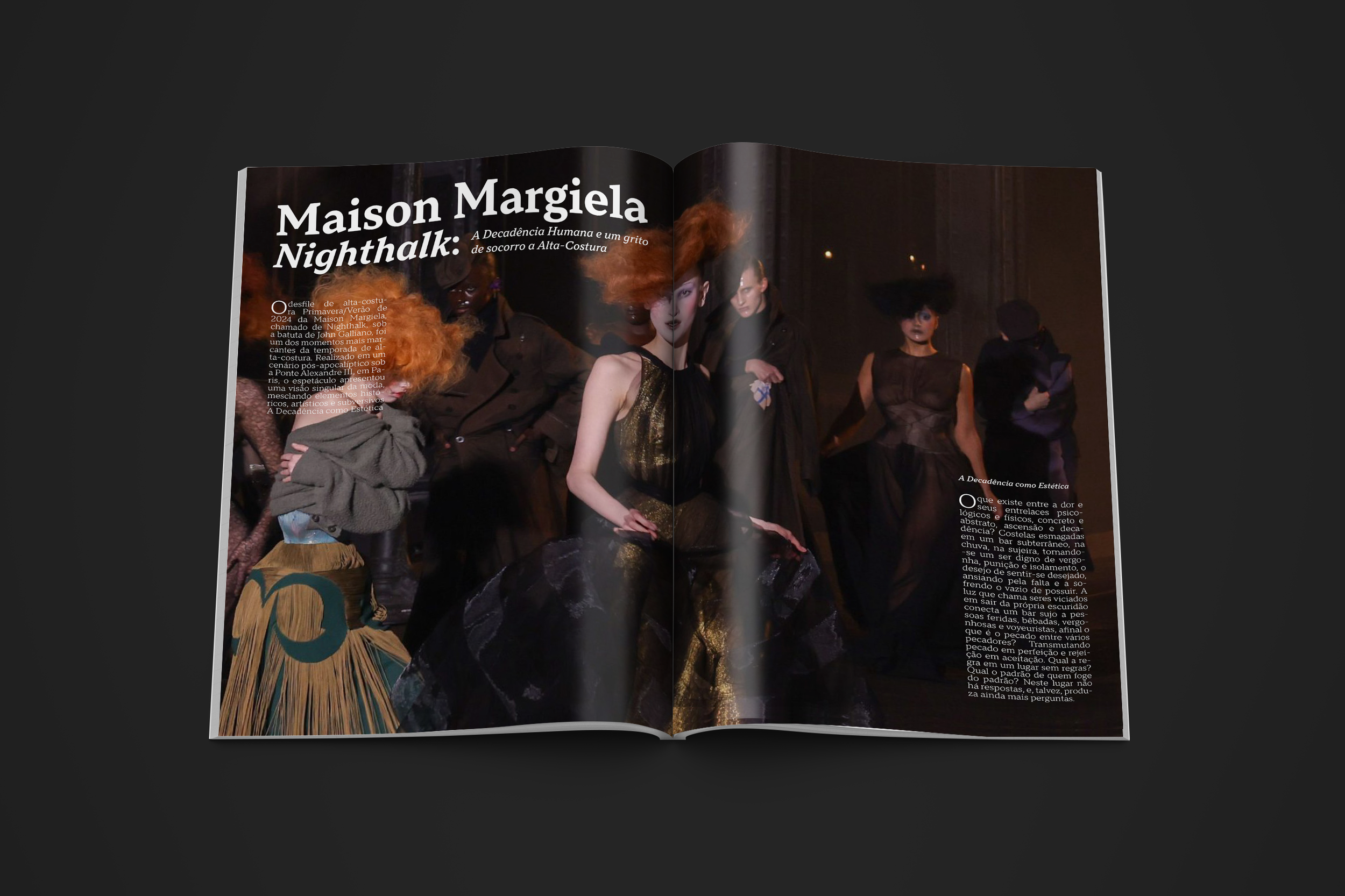
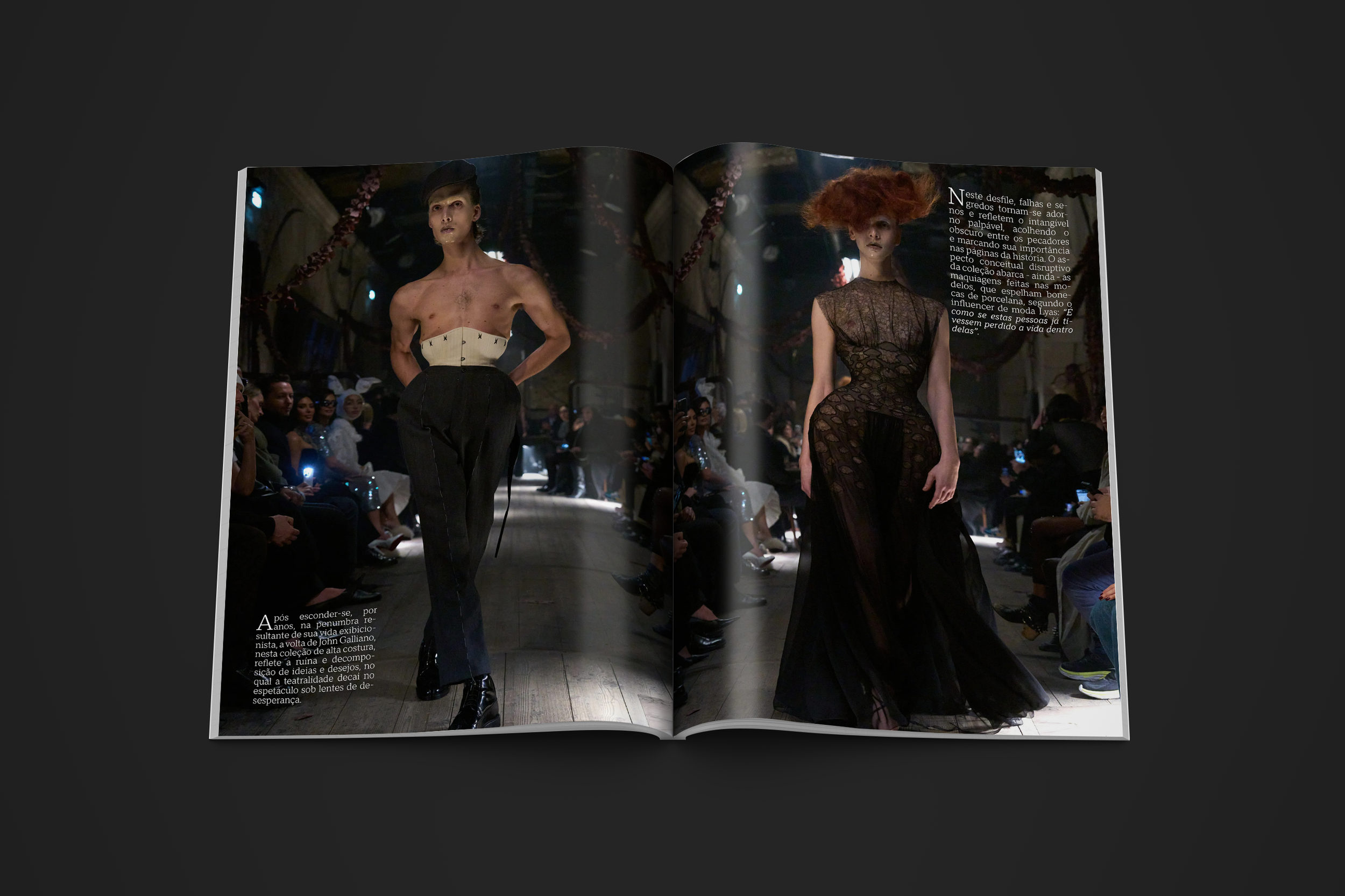
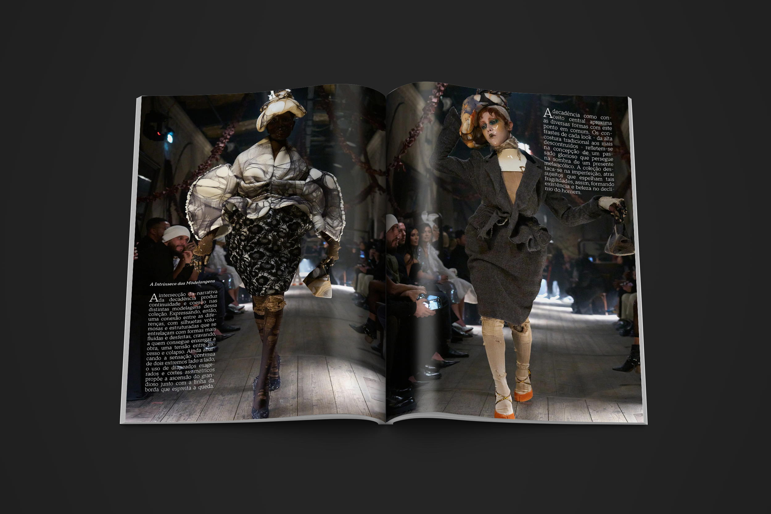
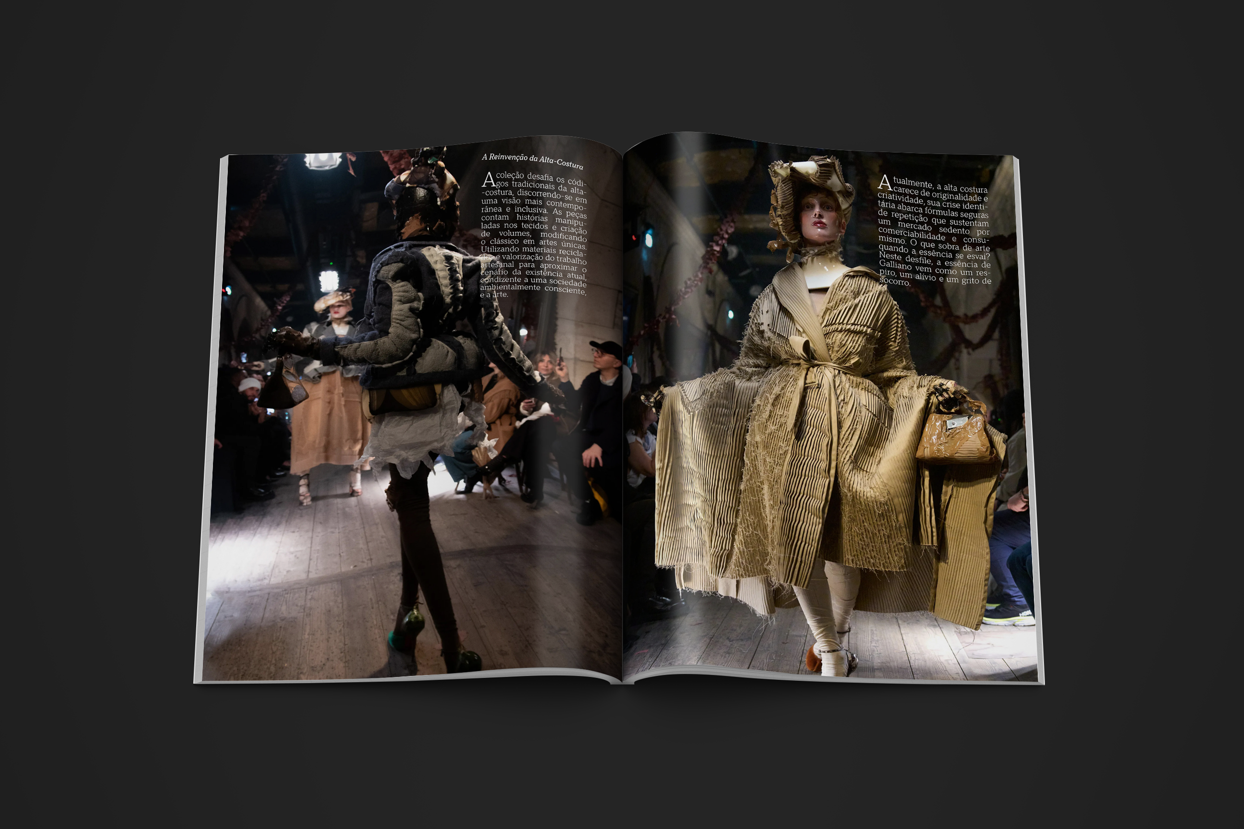
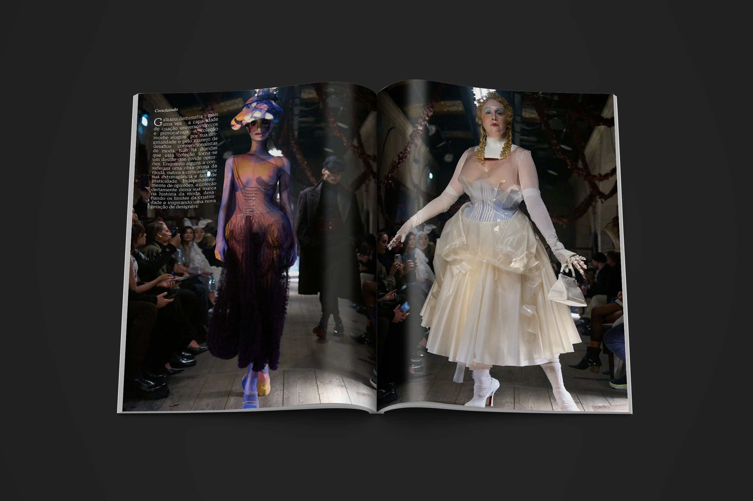
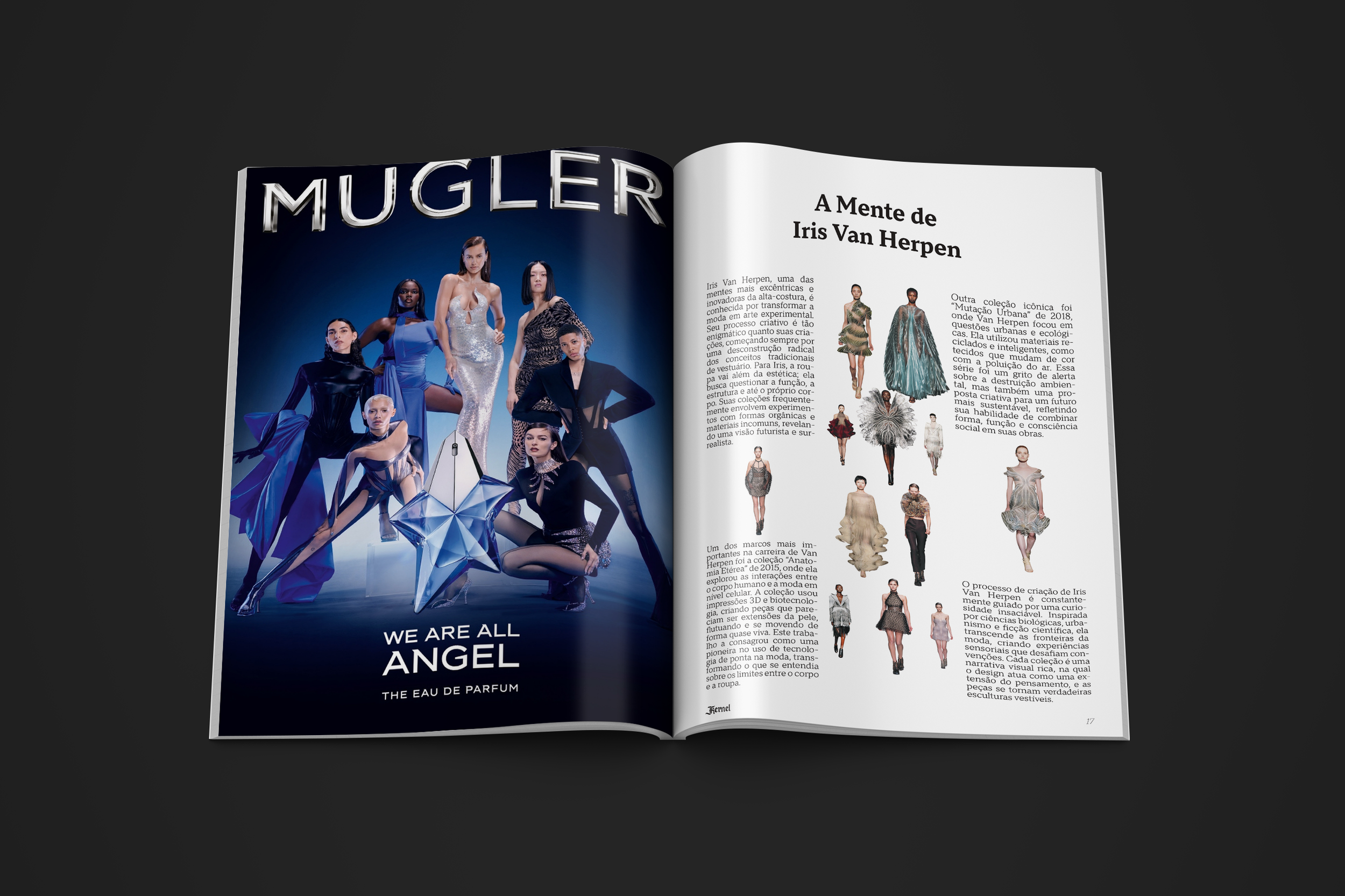
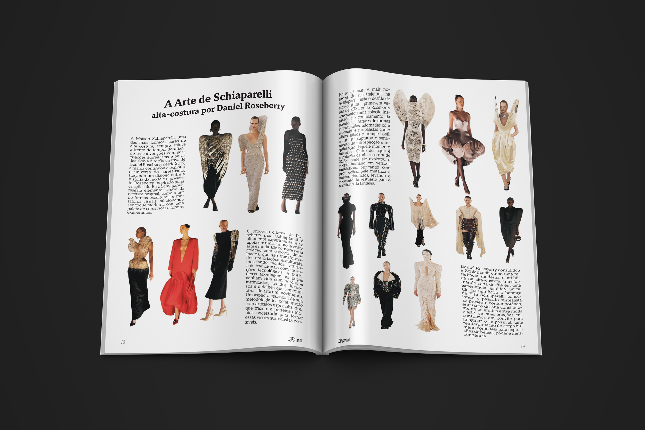
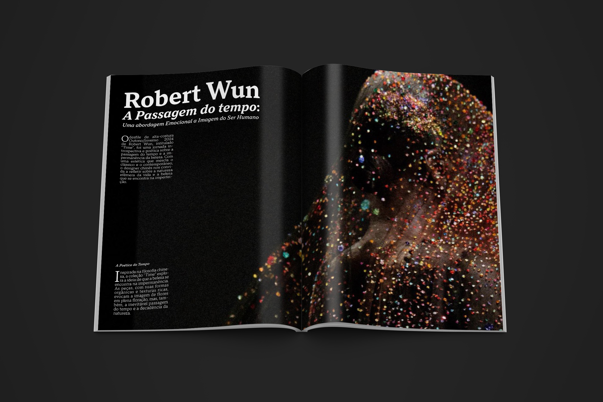
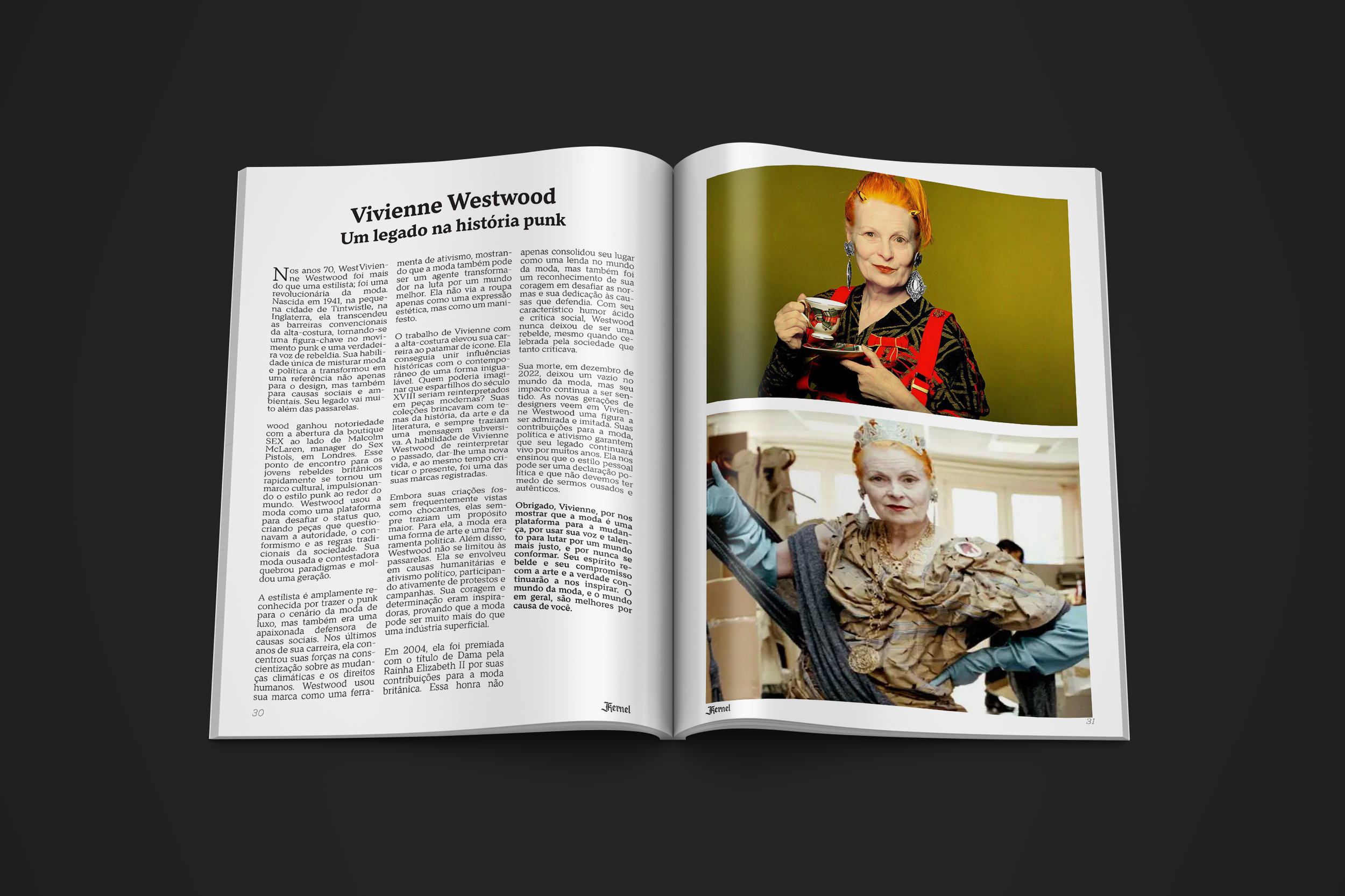
In this post, I'll take you through the creative process behind Kernel Magazine, a seasonal fashion critique publication that dives deep into haute couture and the Paris Fashion Week. With Kernel Magazine now celebrating its 5th anniversary, this edition focuses on two of the industry's most influential shows. In the process, I employed several strategic design methods—including persona development, the double diamond framework, empathy mapping, and the CSD matrix—to ensure a well-rounded and impactful final product.
Understanding the Audience Through the Persona
To create a magazine that truly resonates, it was essential to understand our target readers. I developed a detailed persona, Nadine, a 24-year-old design assistant based in São Paulo. Nadine is passionate about conceptual fashion and high couture, following events like the SPFW (São Paulo Fashion Week) and Casa dos Criadores closely. With influences ranging from Björk to Arca, Nadine embodies the curious, artistic spirit that Kernel aims to engage. This persona helped anchor our content strategy, ensuring that each article, critique, and visual was both insightful and emotionally compelling.
Double Diamond Model
The project followed the double diamond model—a design thinking process that is split into four distinct phases: Discover, Define, Develop, and Deliver. This structured approach allowed us to:
Discover: Research the current landscape of fashion magazines, analyze trends in haute couture, and gather insights each from designers and fashion professionals.
Define: Narrow down the core issues and opportunities based on our research and the insights derived from our persona.
Develop: Brainstorm and prototype different layouts, content strategies, and visual designs that align with our refined vision.
Deliver: Finalize the magazine layout and content, ensuring that it not only meets the high aesthetic standards of our audience but also communicates a deep, analytical narrative.
Empathy Map
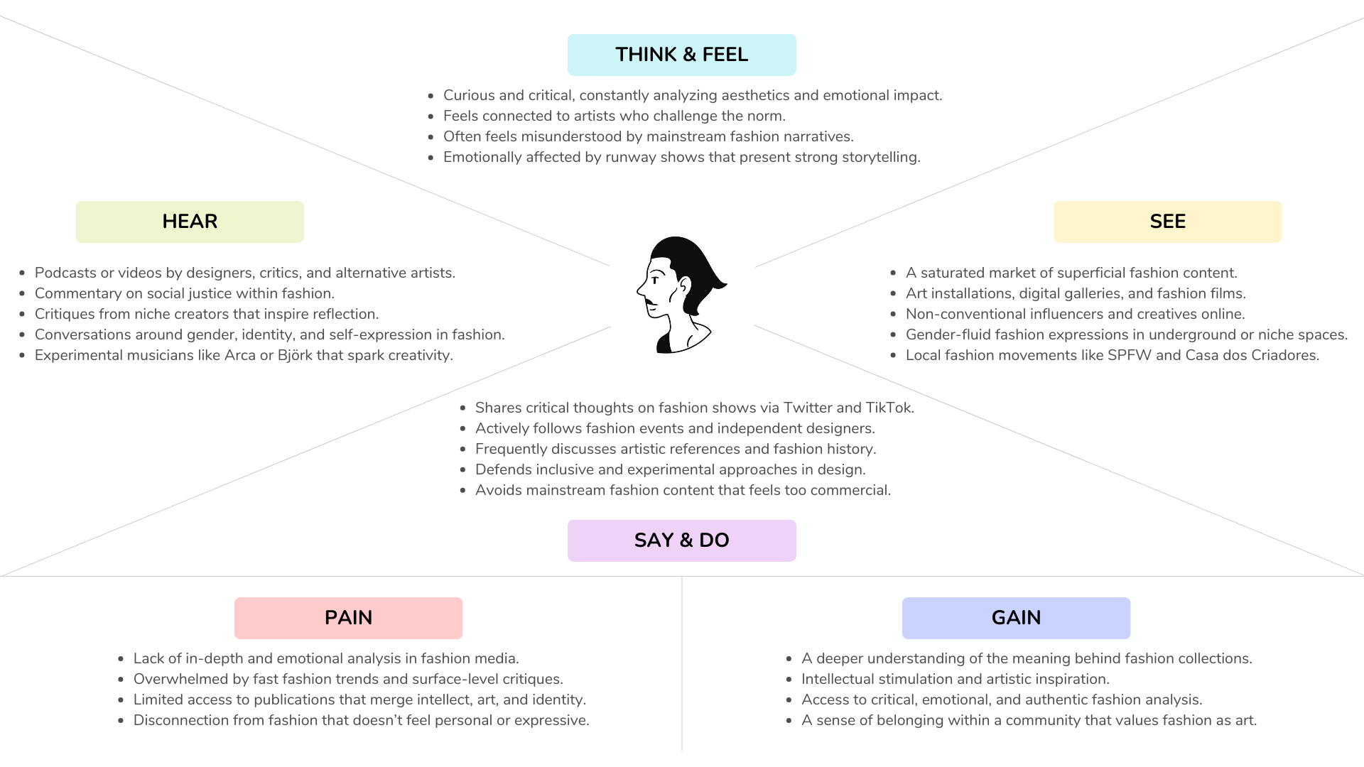
Empathy mapping played a crucial role in our process. By mapping out what our readers might see, hear, think, and feel, we were able to identify and address their needs and expectations. This method provided a clear picture of the emotional journey our audience experiences when engaging with high fashion critiques. The insights gained allowed us to fine-tune the tone and depth of our articles, making sure they were as engaging and informative as possible.
CSD Matrix
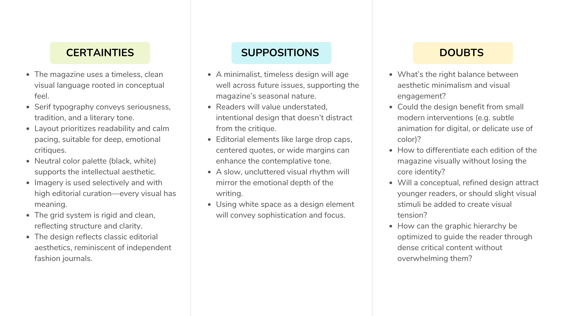
To prioritize our creative efforts, I employed the CSD Matrix (Consider, Simplify, Develop). This tool was instrumental in balancing the multiple dimensions of content, design, and user engagement:
Bringing It All Together
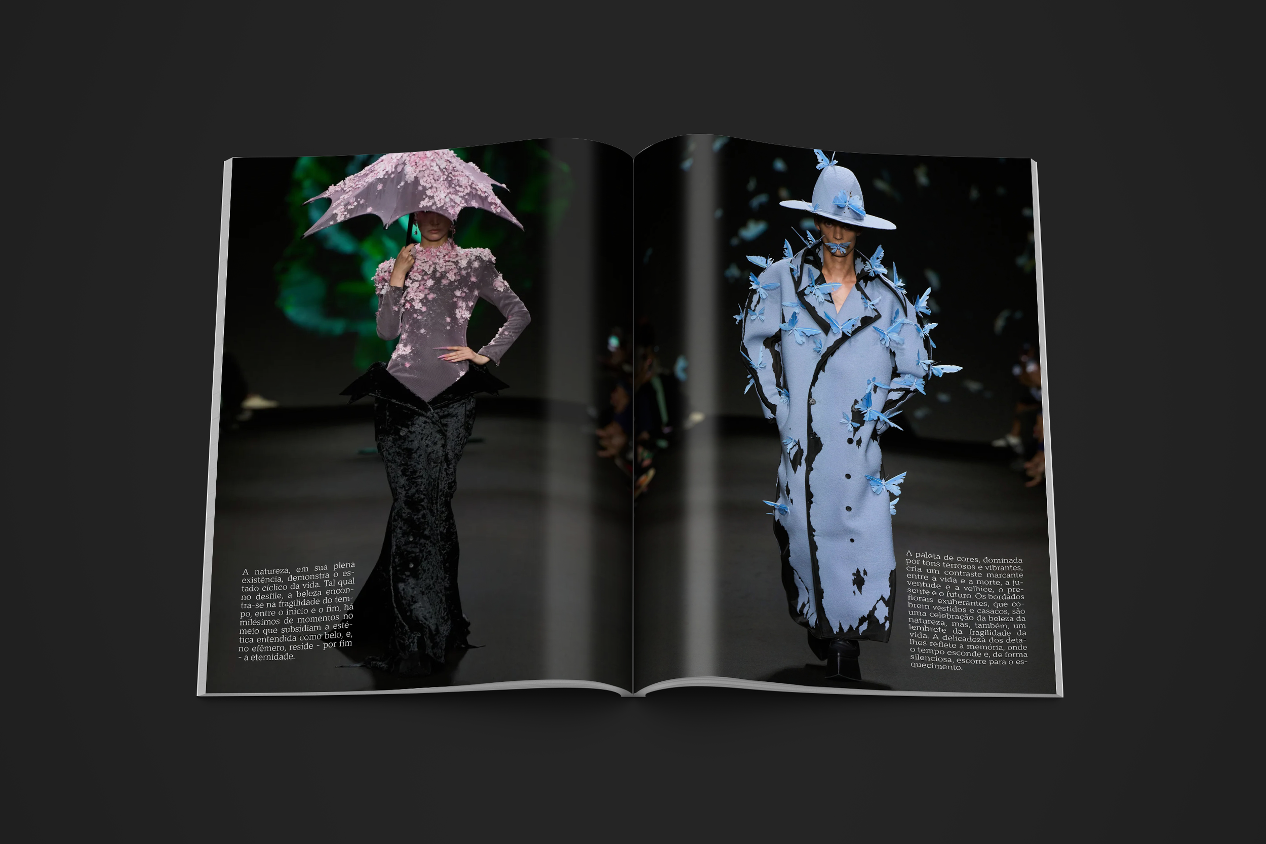
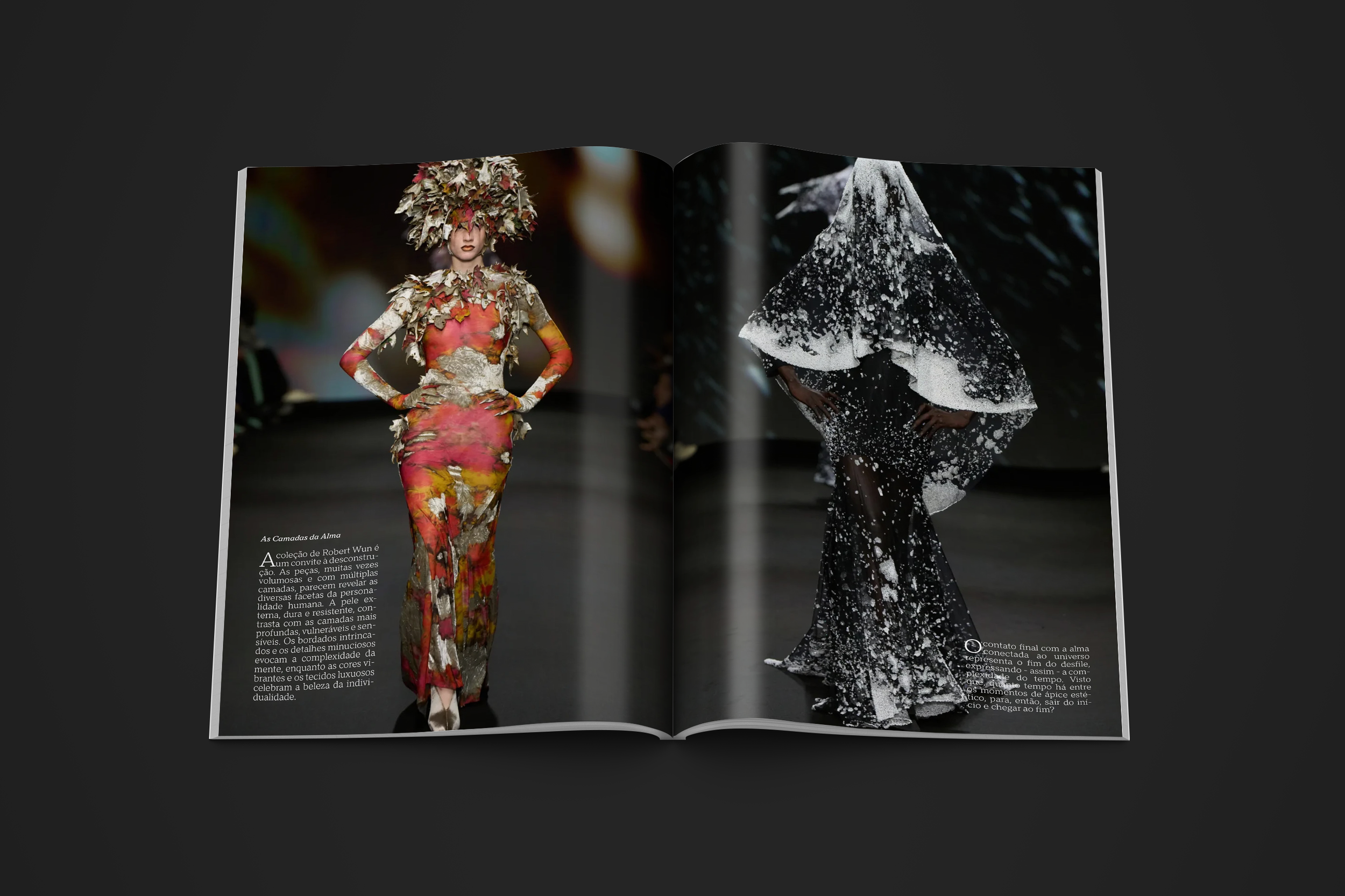
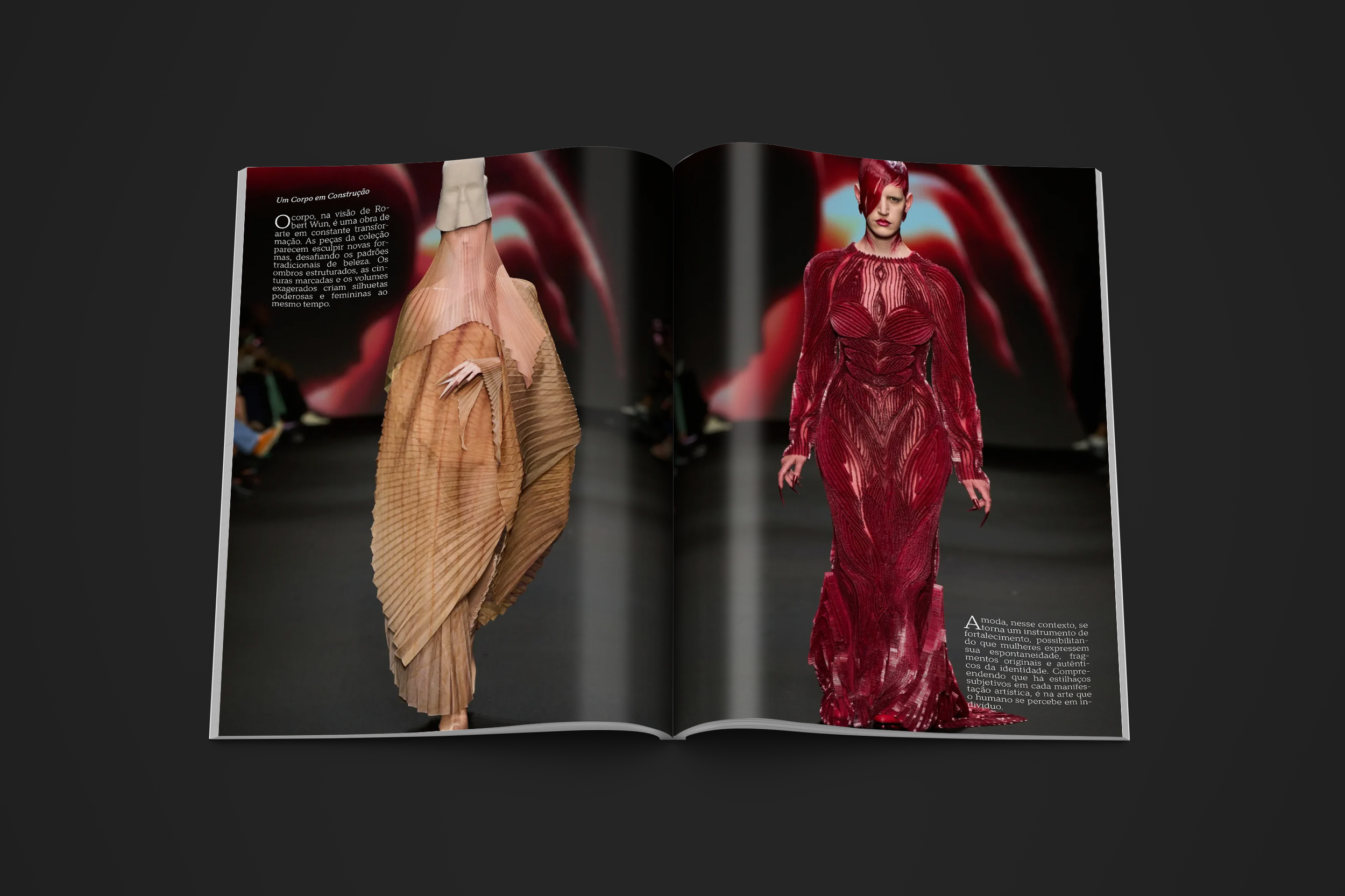
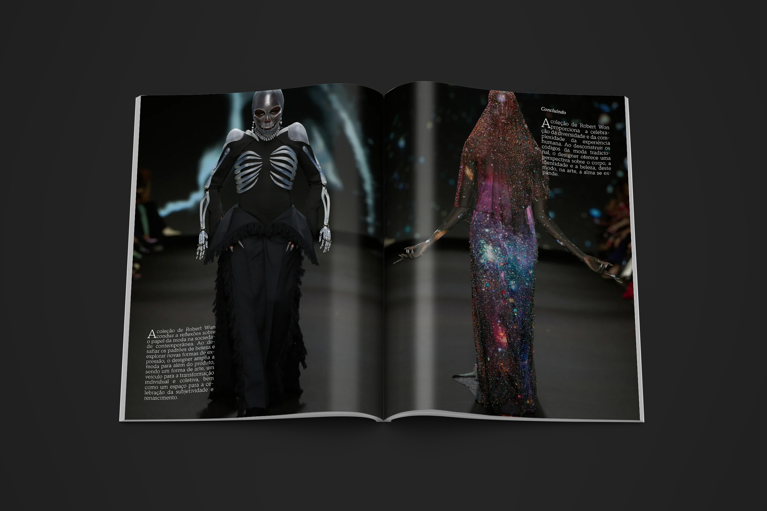
Kernel Magazine is a fictional college project that explores fashion criticism through a refined and conceptually driven lens. Despite its academic nature, the magazine was developed with the same care and strategy applied in professional editorial design. The goal was to simulate a real-world publication that could stand alongside established independent fashion journals—thoughtful, timeless, and emotionally engaging.
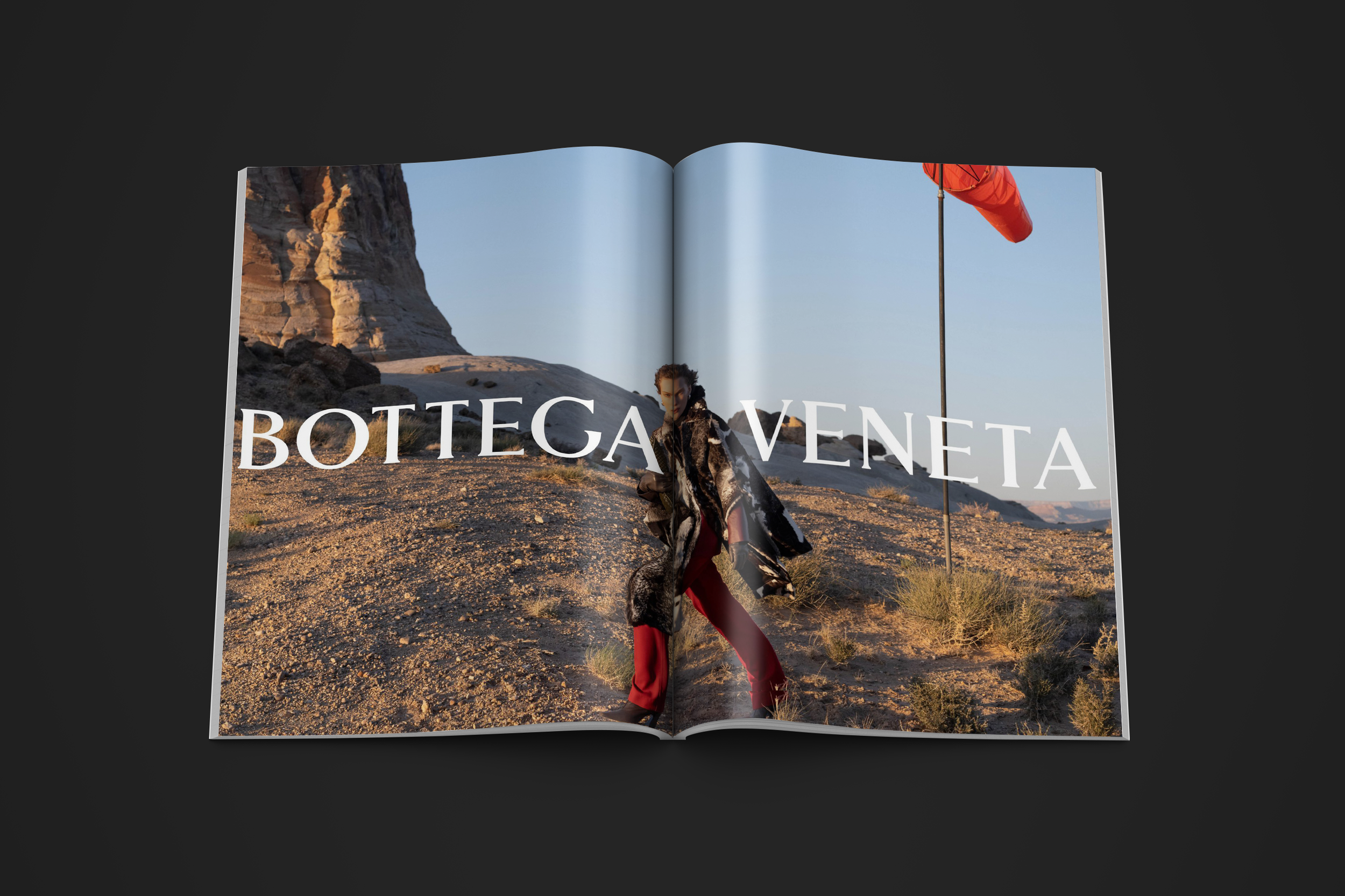
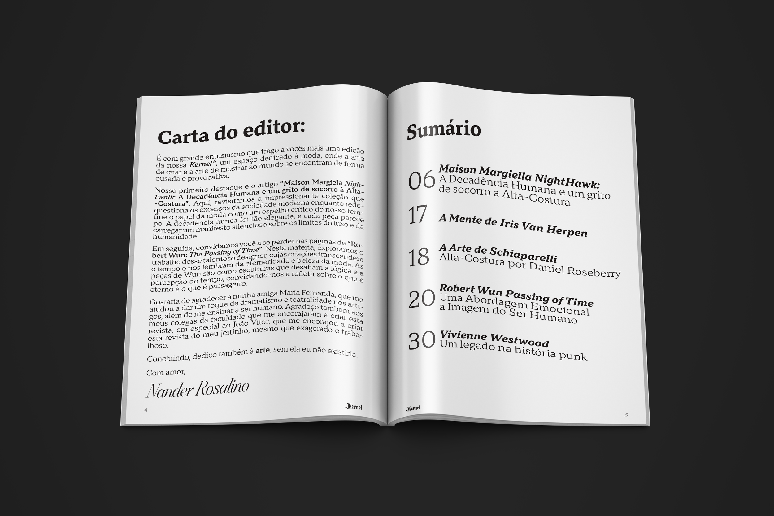
Kernel focuses on haute couture and the seasonal fashion calendar, combining in-depth critique with an atemporal visual aesthetic. The design avoids flashy or experimental visuals, instead embracing a quiet sophistication: serif typography, clean grids, generous white space, and carefully selected imagery. The visual identity seeks to support the narrative, not overpower it—creating a space where the emotion and artistry behind each collection can resonate deeply with the reader.
This project demonstrates how design can elevate content, especially when paired with a critical and emotional approach to fashion storytelling.
Pet Food Acessible Packaging
Packaging Design
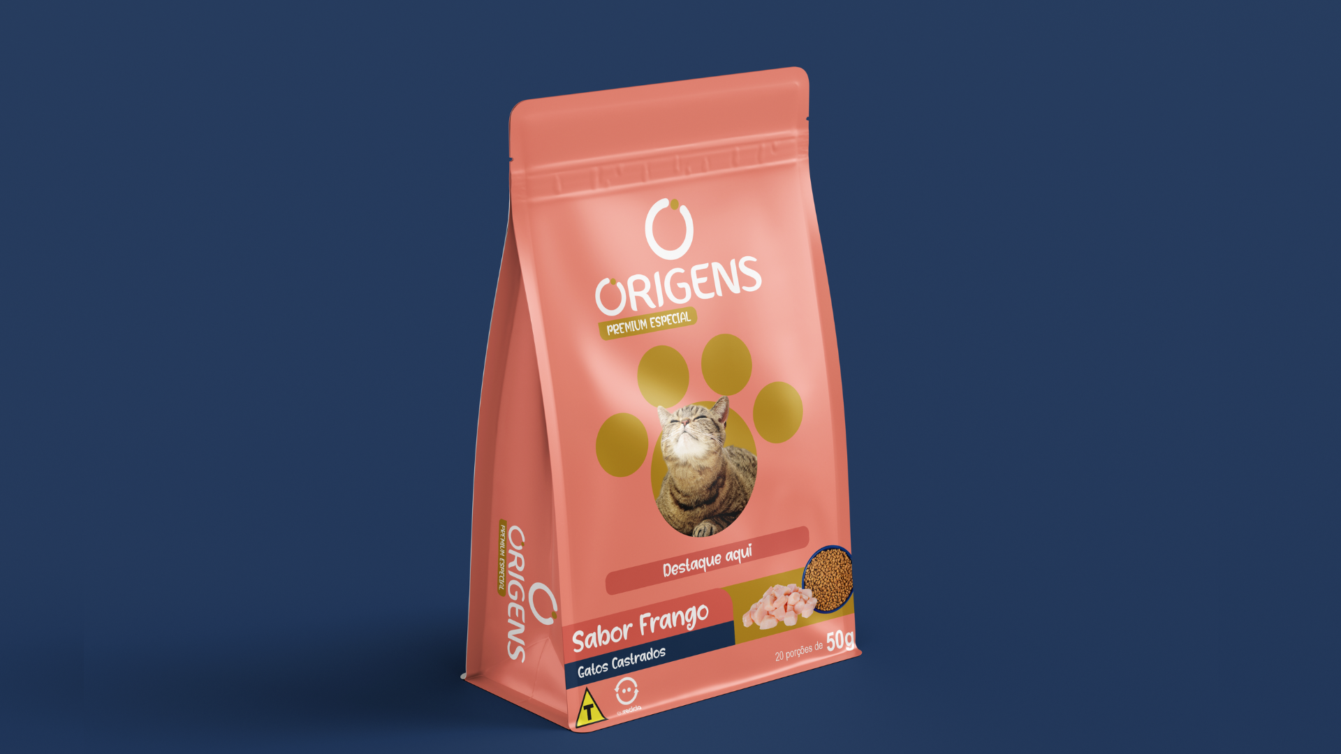
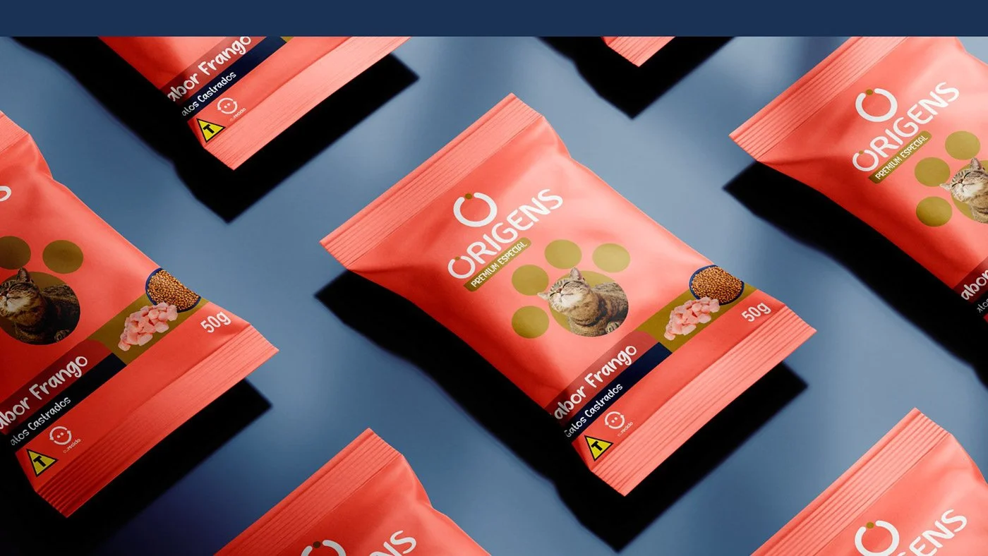
For many pet owners, feeding their beloved animals is more complicated than it seems. From accurately measuring the right amount of food to handling heavy, bulky packages, everyday tasks can become a challenge—especially for those with physical limitations. In response, my college project set out to design a pet food packaging solution that simplifies feeding routines through pre-portioned packets neatly nested within a larger package. Developed in partnership with Canguru for packaging and commissioned by Adimax/Origens, this project is not just about aesthetics—it’s about accessibility, independence, and care.
Design Strategy
Our design strategy focused on creating a solution that addresses key user challenges:
Accessibility: The packaging is divided into smaller, pre-dosed portions, making it easier to handle, open, and transport—ideal for users with limited strength or motor skills.
Functionality: Each smaller packet ensures accurate measurement, eliminating guesswork and waste. Its lightweight nature and user-friendly design offer independence to those who might otherwise rely on help.
Visual Alignment: The design maintains a simple aesthetic that aligns with the partner brands (Adimax/Origens), using clean lines and a straightforward color palette that communicates reliability and clarity.
Inclusivity: Every design decision was informed by a commitment to make feeding pets a stress-free experience for all, regardless of physical ability
Understanding the Audience Through the Persona
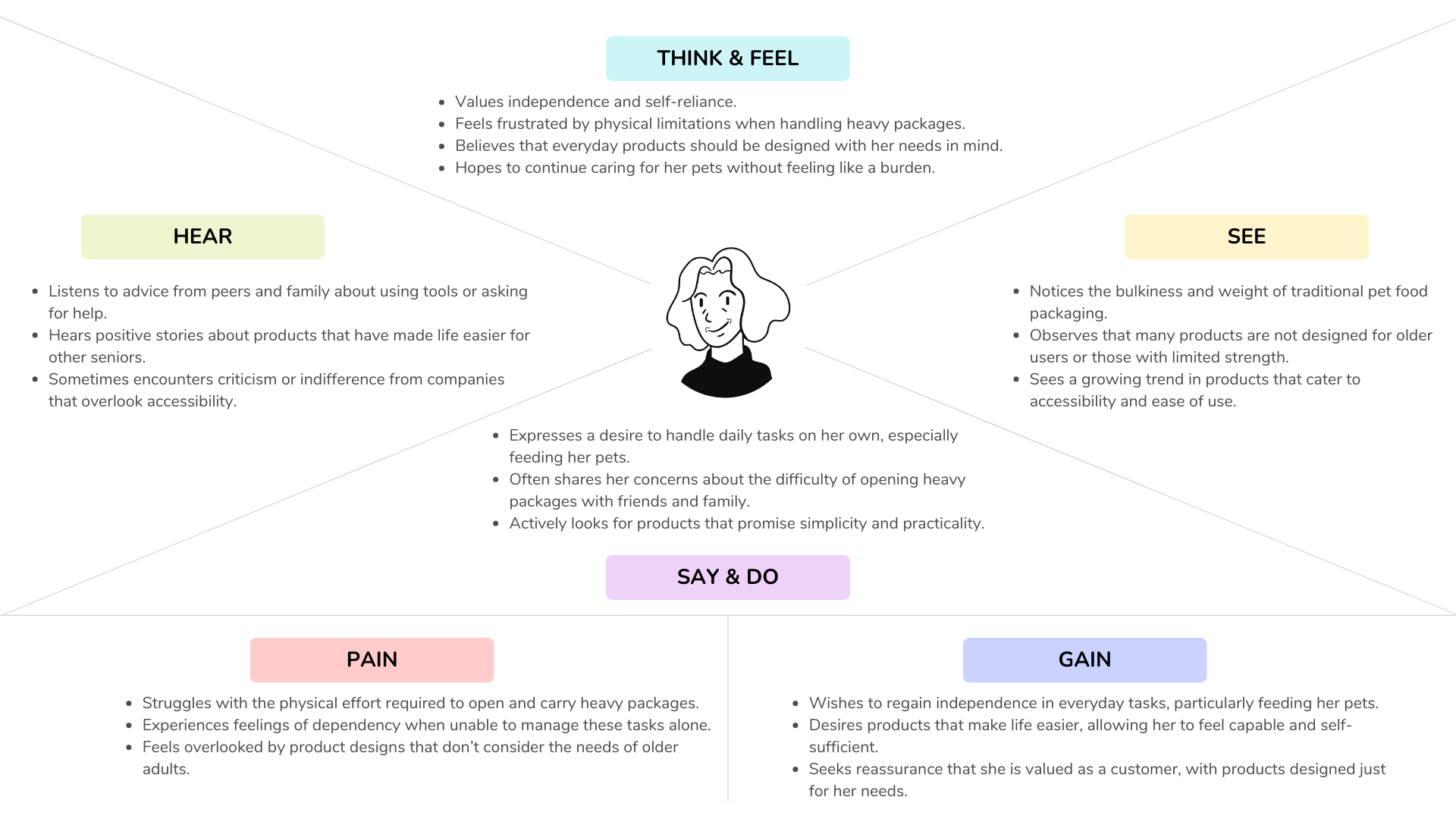
Meet Camila, our guiding persona. Camila is a 60-year-old widow living alone in Garopaba, Santa Catarina, with her three cats. Despite her love for her pets and her creative hobbies—such as knitting cute pet accessories—Camila faces a daily struggle with heavy and cumbersome pet food packages. She values her independence and yearns to perform everyday tasks without having to rely on her neighbor, who happens to be her grandchild. Camila’s story was central to our design process, ensuring that the final packaging is both practical and empowering for users like her.
Empathy Map
To truly capture Camila’s experience, I created an empathy map highlighting her thoughts, observations, actions, and feelings:
CSD Matrix
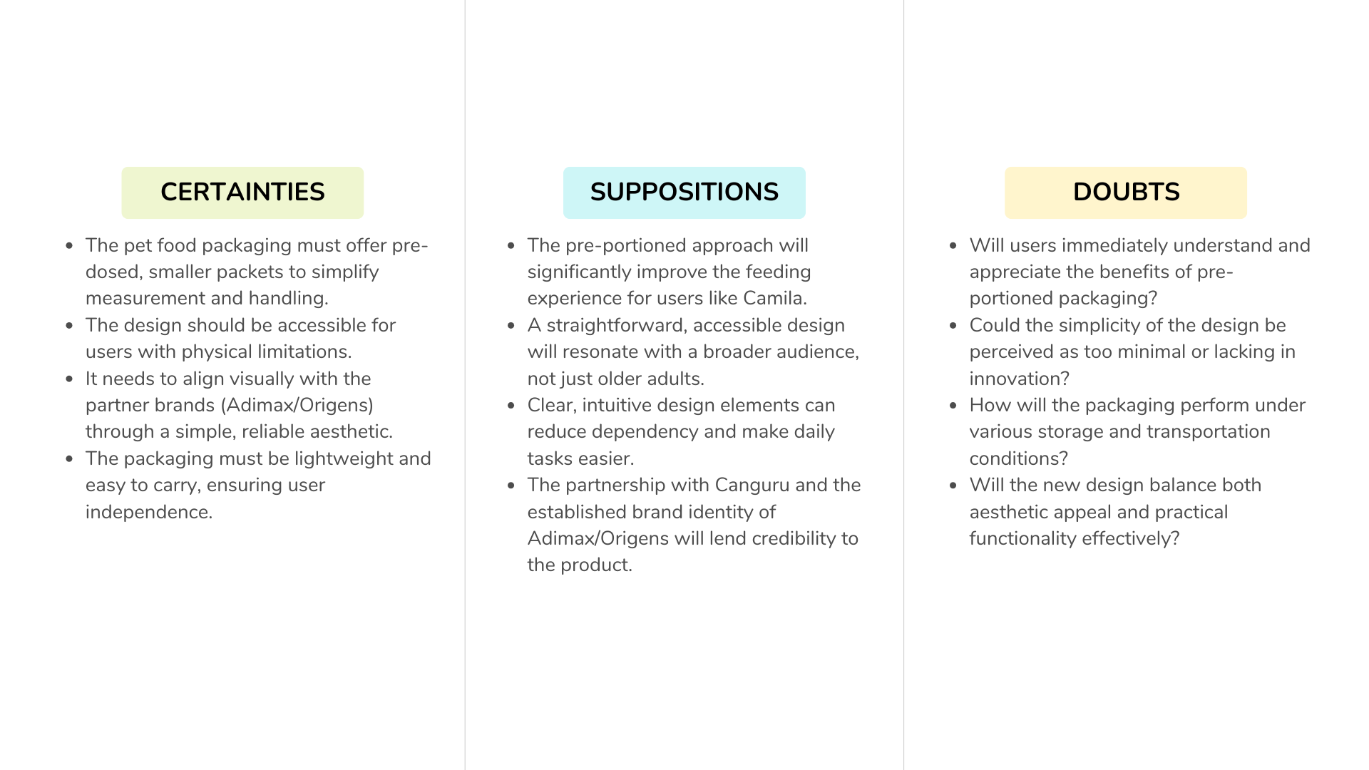
To structure our design decisions, we used the CSD Matrix (Certainties, Suppositions, Doubts):
The Final Packaging Solution
The final design for our pet food packaging is a result of careful research, empathy, and iterative design processes. It not only addresses the physical challenges faced by pet owners—such as accurately measuring food and handling heavy packages—but also champions independence and accessibility for everyone. By dividing the packaging into pre-dosed, smaller packets, we have created a solution that is easy to handle, carry, and open, ensuring that even those with limited strength can feed their pets without extra help.
Inspired by the iconic Brazilian “puxa saco”—a plastic bag holder that allows one bag to be pulled while the next is seamlessly dispensed—we designed an internal dispensing system where one portion packet is always ready to go. This clever mechanism adds familiarity and intuitive usability, allowing users to effortlessly remove one food pack at a time while keeping the remaining ones organized inside the main package.
The design maintains a clean, simple aesthetic in line with Adimax/Origens, focusing on functionality while still communicating trust and reliability. Ultimately, this project is a testament to how thoughtful design can transform everyday challenges into empowering experiences, ensuring that every pet owner, like Camila, can care for their animal companions with dignity and ease.
