Coé Biquíni Bar
Coé Biquini Bar is a fictional branding project developed in an academic setting, with the goal of designing a vibrant, culturally-rooted visual identity for a fictional bar located in Copacabana, Rio de Janeiro. Inspired by the legacy of Tropicália, the project merges Brazil’s rich musical heritage with a fresh, contemporary aesthetic that celebrates diversity, community, and artistic expression.
More than just a bar, Coé is a space of cultural resistance and celebration. Its core values—support for cultural expression, comfort and belonging, and the joy of tropical sounds like samba and Bossa Nova—are deeply embedded in the design process. From concept to execution, this project aims to reinterpret Brazil from a local and affectionate perspective.
Understanding the Audience Through the Persona
To build an identity that felt real and grounded, the persona of Matheus Nkosi dos Santos was developed. Matheus is a 28-year-old Black architect living in Rio de Janeiro, specifically in Barra da Tijuca with his husband and their three cats. Spiritually connected to his roots, he is a practitioner of religions of African origin and regularly attends friday-night rituals. Deeply passionate about samba and pagode, Matheus plays the pandeiro and enjoys painting watercolors in his free time.
Matheus’s life is a blend of tradition and modern expression, art and community—exactly the kind of person who would feel at home at Cóe Biquini Bar.
Double Diamond Model
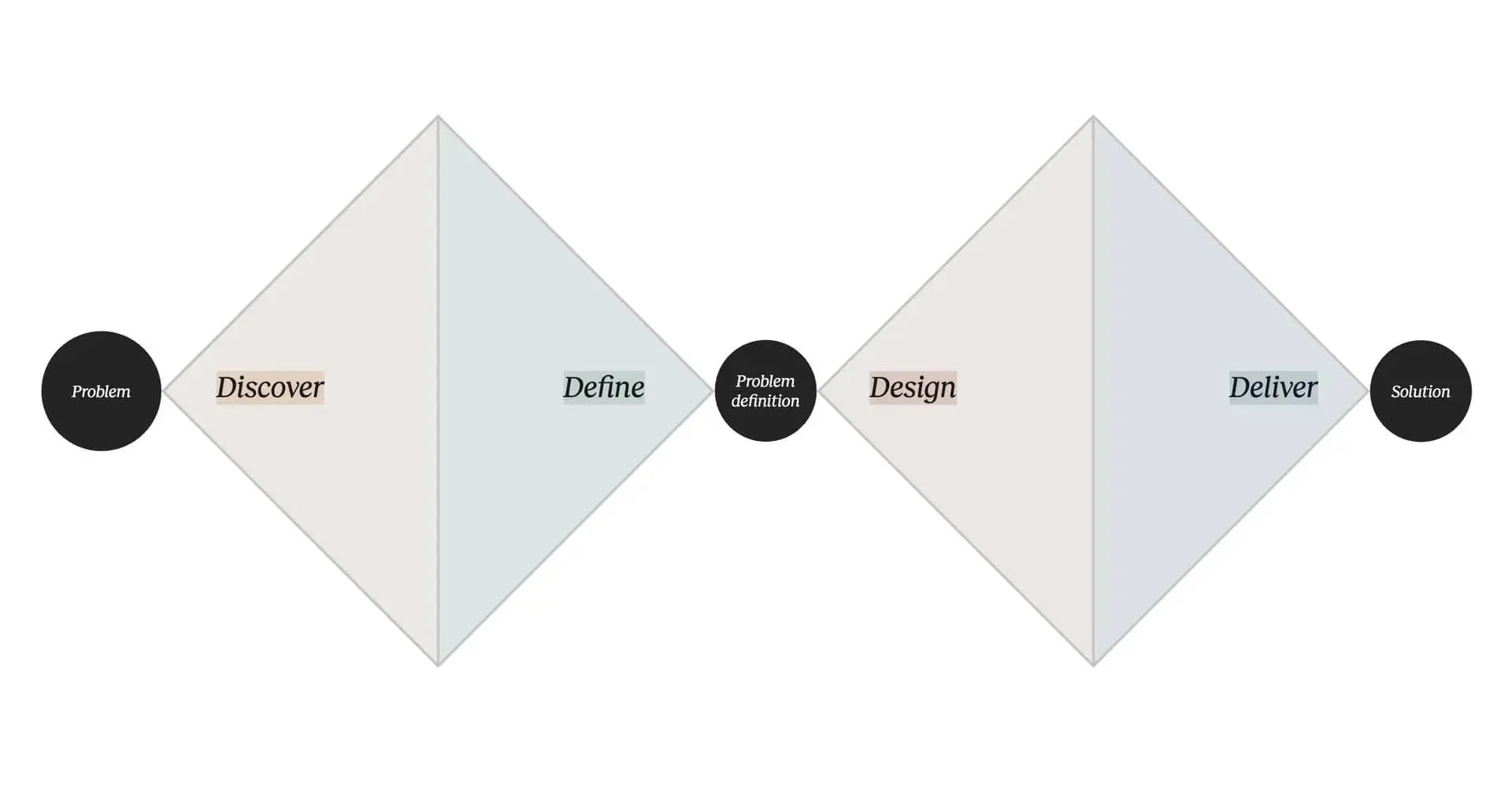
The development of Cóe Biquini Bar’s visual identity was guided by the Double Diamond framework, which allowed the project to unfold in an organized yet creative way. This methodology helped align research with intuition, ensuring the final design was not only beautiful, but also deeply rooted in meaning.
Discover: Research the Brazilian cultural landscape—specifically the Tropicália movement—exploring its aesthetic codes, musical influences, and resistance-driven spirit. Analyze how local bars embody cultural expression and gather insights from visual trends tied to samba, Bossa Nova, and the Carioca lifestyle.
Define: Narrow down the essence of the bar: a vibrant and inclusive space that expresses Brazil from an insider’s perspective. Define the brand values—cultural celebration, comfort, and freedom of expression—and build the persona that represents the emotional core of the audience.
Develop: Brainstorm and prototype logo concepts, color palettes, and typography that reflect the project's tropical and groovy aesthetic. Experiment with visual metaphors (such as transforming the “O” into a bikini) and design components that reinforce the bar’s atmosphere of joy and belonging.
Deliver: Finalize the full visual identity—including logo variations, color palette, typography, and branded mockups for digital and physical applications. Ensure the design communicates the bar’s spirit clearly, embracing cultural richness and a contemporary Brazilian voice.
Empathy Map
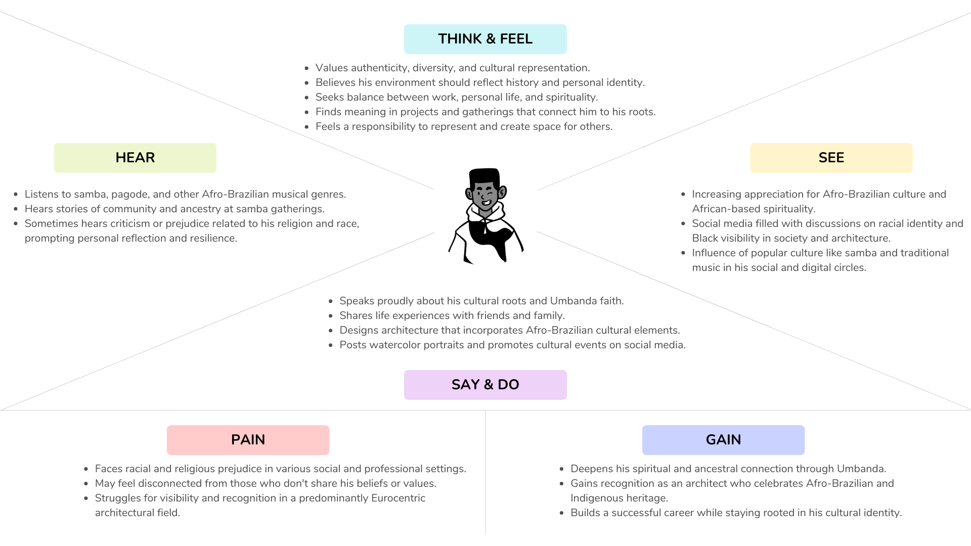
To better understand the emotional landscape of the target audience, an Empathy Map was created for Matheus, helping define how he sees, feels, acts, and connects with his environment. This tool was essential in shaping a brand that not only looks Brazilian, but feels Brazilian.
CSD Matrix
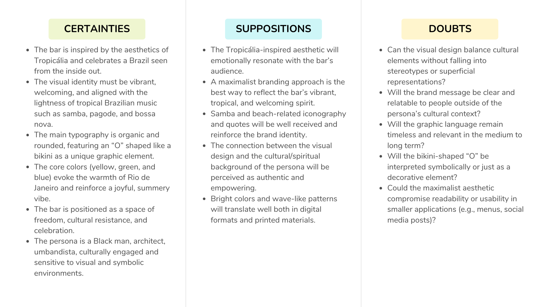
The CSD Matrix (Certainties, Suppositions, Doubts) helped structure the design priorities, keeping the focus on cultural authenticity. Certainties like "Brazilian design should not look imported" shaped the choice of visual elements, while doubts about the fine line between cliché and homage inspired a careful curation of symbols, colors, and language.
The logo
The visual identity was designed using a fun and groovy approach—joyful, and unapologetically Brazilian. The project began with conceptual and strategic research using the Double Diamond framework, followed by a human-centered design process with tools like persona development and empathy mapping.
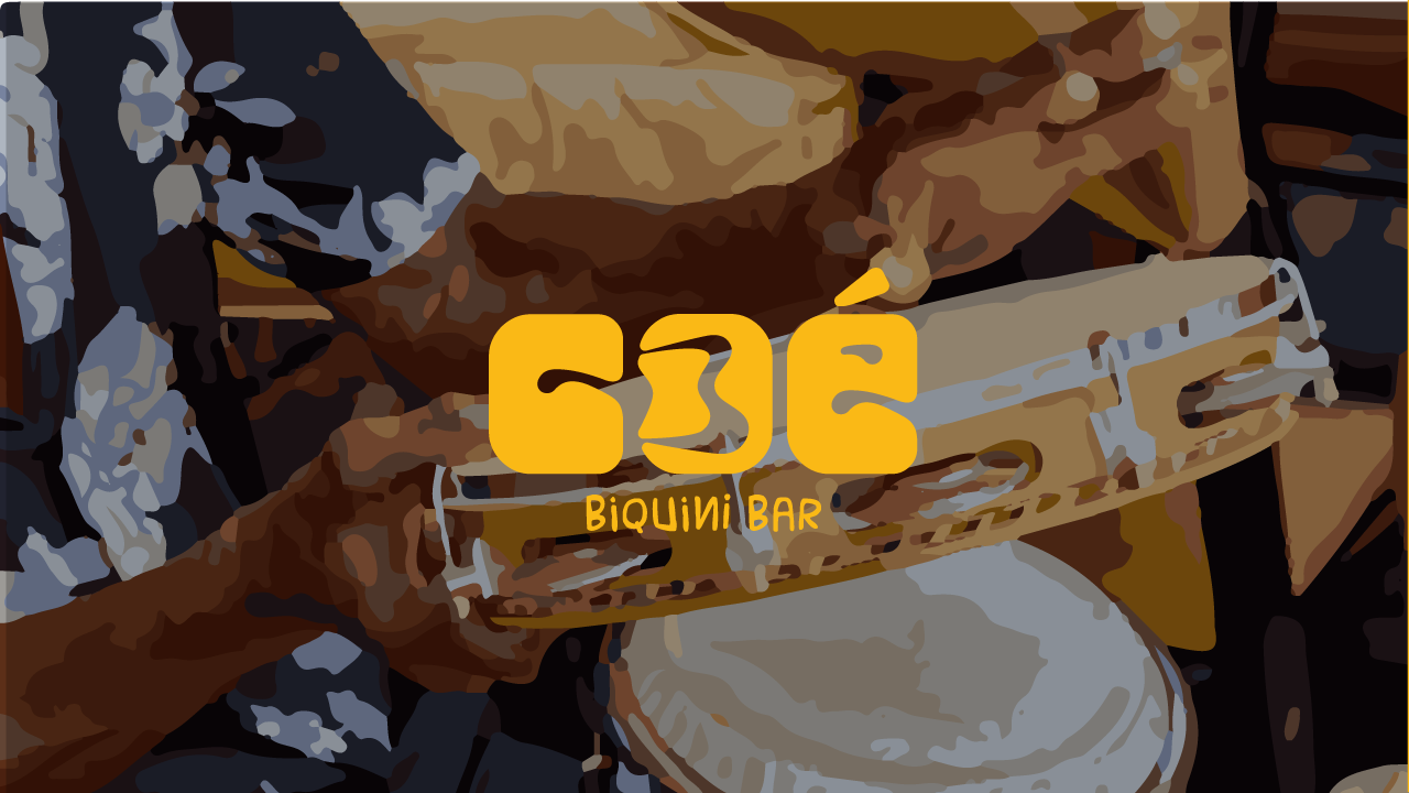
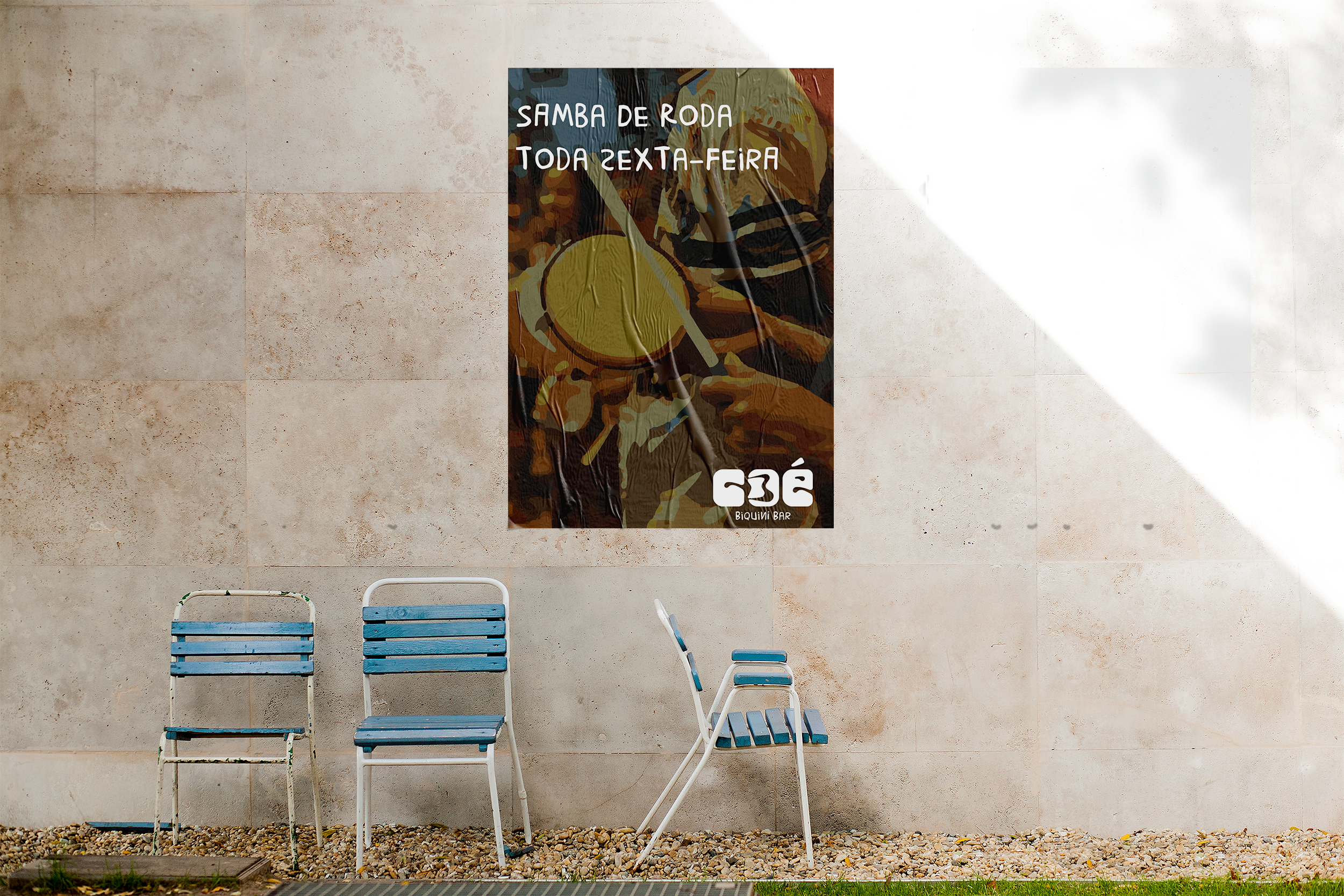
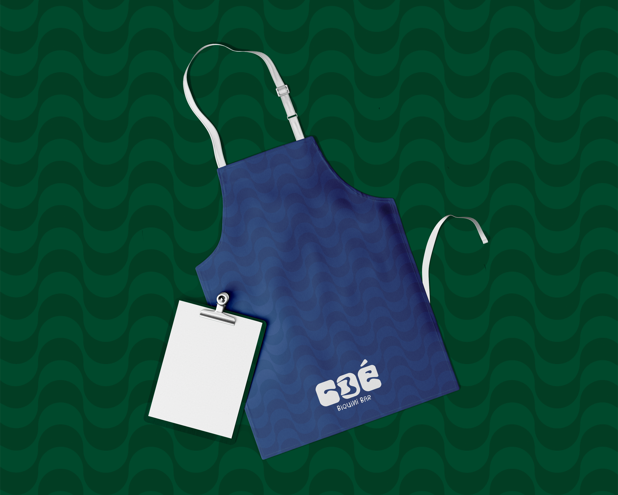
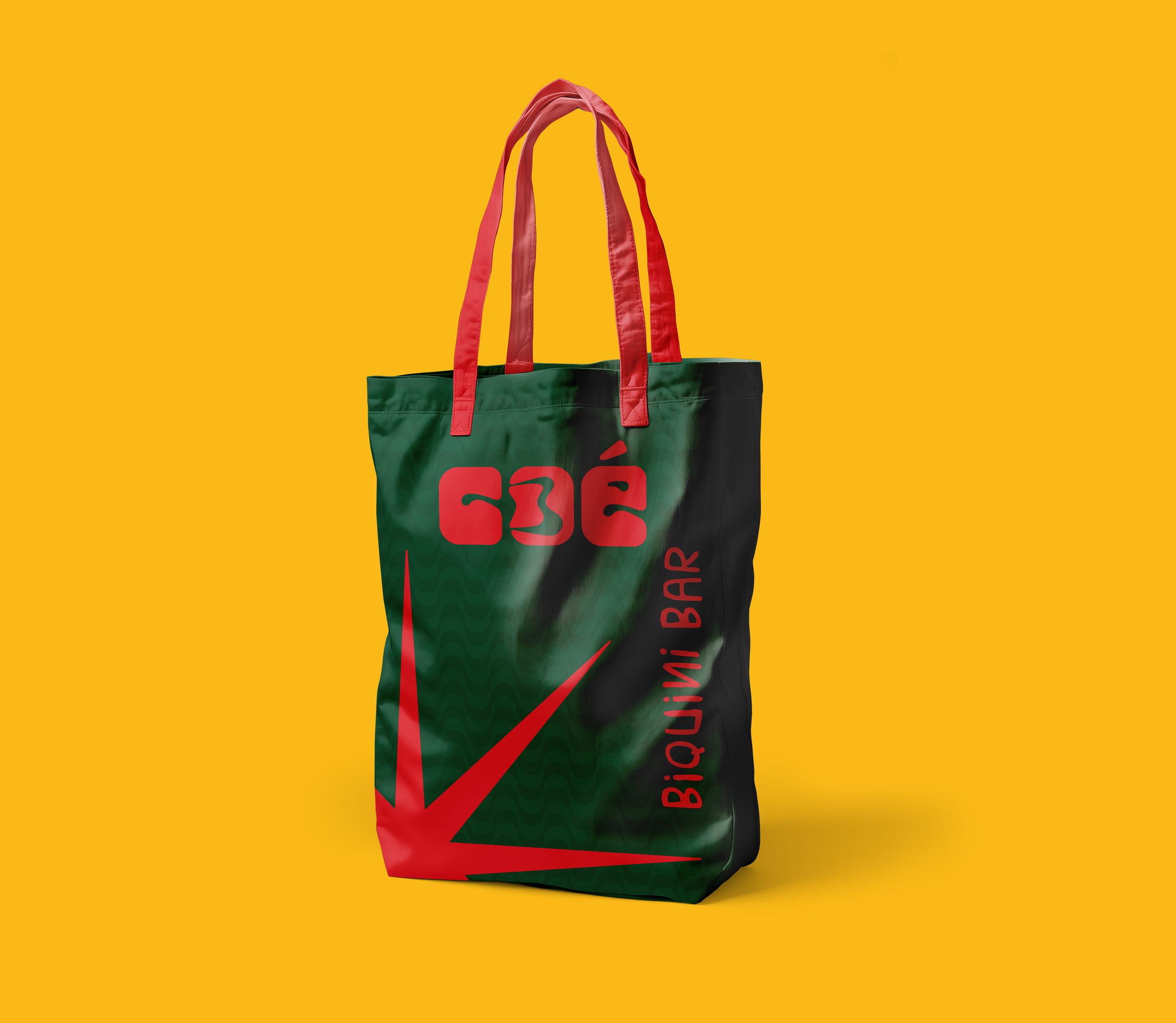
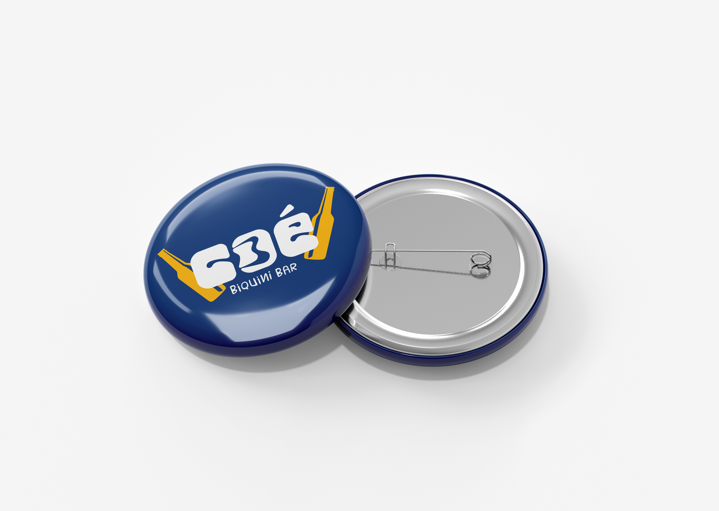
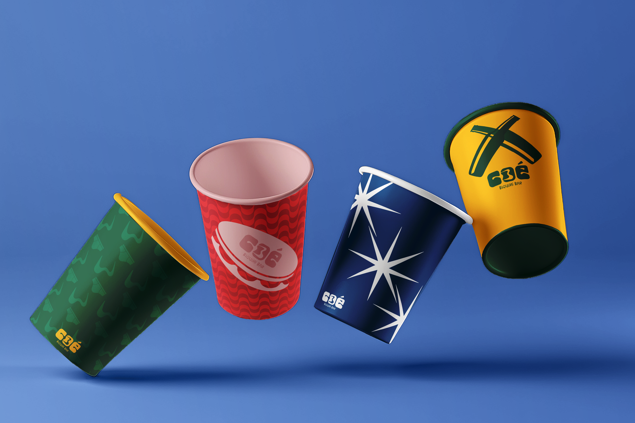
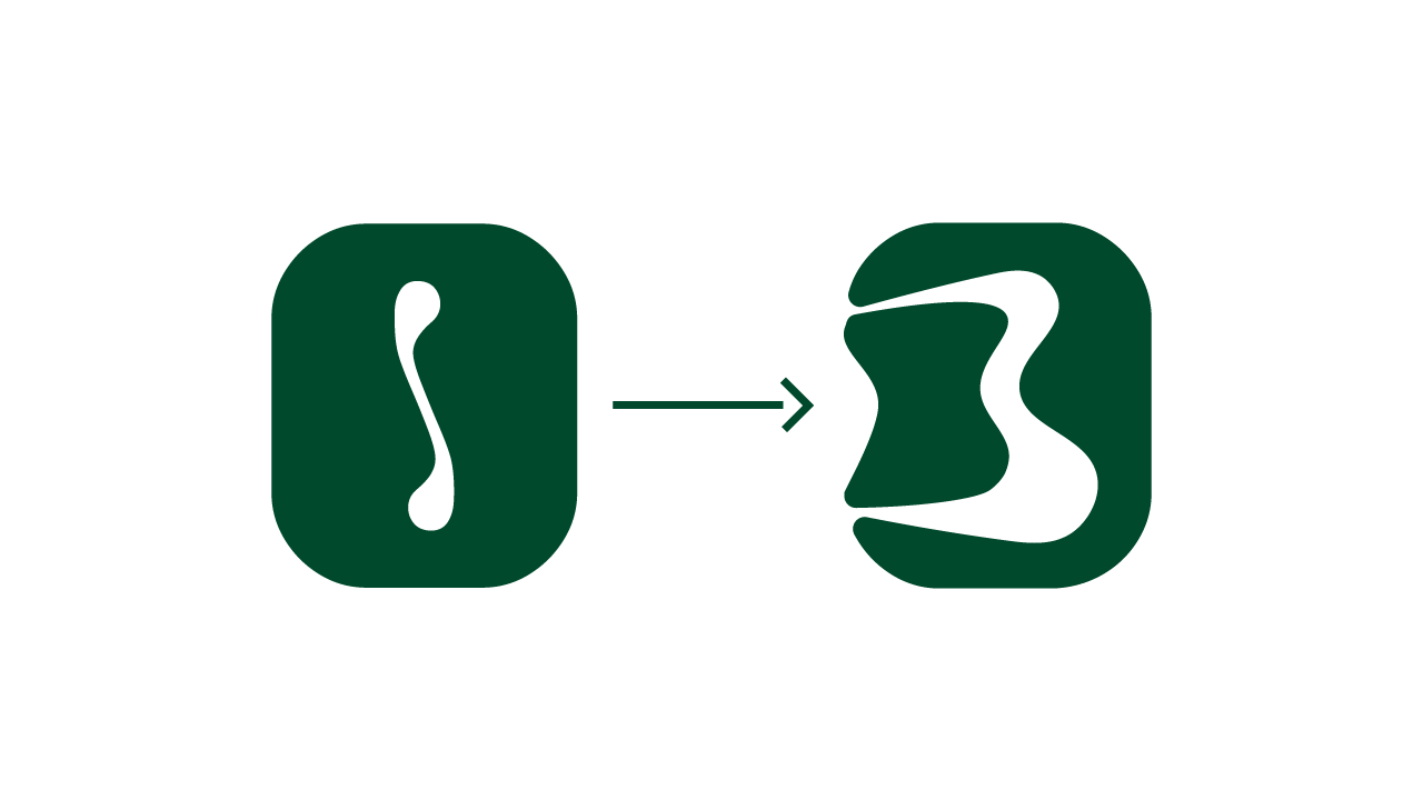
The visual direction embraces organic and rounded typography, where even the “O” in the logo morphs into a playful bikini icon. Wavy patterns, beach-inspired textures, and lyrical phrases drawn from samba songs all contribute to the rich sensory atmosphere of the brand.
Final product
Cóe Biquini Bar is more than a branding project—it’s a joyful declaration of Brazilian identity. Through every rounded curve, every sun-drenched color, and every rhythmic phrase, the design captures the heart of a Brazil that is alive, expressive, and resistant. It’s a place where the past and present meet through song, sea, and soul.
The identity doesn’t shy away from complexity. Instead, it embraces the contradictions and layers that define Brazilian culture: spiritual and festive, traditional and avant-garde, intimate and communal.
Though fictional, Cóe feels alive. It’s a project born from cultural memory and future aspirations—where everyone is welcome to sing, celebrate, and simply be.
